Microsoft Fluent 2
Microsoft’s cross-platform design system behind Microsoft 365. Fluent UI React v9 ships alias tokens (colorNeutralBackground1, colorBrandBackground…) for web light/dark, a 10–68 px type ramp in Segoe UI, a six-step shadow ramp (shadow2–shadow64), a 2–40 px radius scale and 50–500 ms motion. fluent2.design was unreachable from our box, so evidence comes from the official Storybook and npm package.
Summary
Microsoft’s cross-platform design system behind Microsoft 365. Fluent UI React v9 ships alias tokens (colorNeutralBackground1, colorBrandBackground…) for web light/dark, a 10–68 px type ramp in Segoe UI, a six-step shadow ramp (shadow2–shadow64), a 2–40 px radius scale and 50–500 ms motion. fluent2.design was unreachable from our box, so evidence comes from the official Storybook and npm package.
What it is
An official design system: documented foundations (color, type, layout) plus components and usage guidance.
Who it’s for
Product designers and front-end engineers building apps that should feel native to the platform, or teams studying a mature system before writing their own.
Key takeaways
- Fluent 2 is the design language of Microsoft 365, Teams and Windows, and Fluent UI React v9 is its web implementation.
- Instead of Carbon’s flat layers it uses soft elevation: a six-step shadow ramp (shadow2 to shadow64) that pairs an ambient 2–8 px blur with a key shadow, a radius scale whose everyday steps are 2, 4, 6 and 8 px, and a neutral palette that steps from colorNeutralBackground1 to 6.
- Colour is split into a brand ramp (Communication Blue, #0f6cbd as colorBrandBackground in web light) and neutral and status palettes, all exposed as alias tokens you consume through FluentProvider and the tokens object, so a theme is a plain object you can swap.
- The type ramp runs from caption2 (10/14 px) to display (68/92 px), with 14/20 px body1 as the default, in Segoe UI, which is not openly licensed: on the web, Fluent falls back to the system stack.
- Lessons: expose themes as data, keep one brand ramp and derive hover/pressed from it, use elevation sparingly and consistently, and plan a font fallback when the brand font cannot be shipped.
Best practices to borrow
- Wrap the app in FluentProvider and read colours, spacing and type from the tokens object; never hard-code HEX values.
- Derive a custom brand from a 16-step brand ramp so hover, pressed and selected states stay consistent.
- Use the shadow ramp sparingly: shadow2–4 for cards at rest, shadow16–28 for flyouts, shadow64 for dialogs.
- Keep body text at body1 (14/20 px) and use the type styles (typographyStyles) rather than setting sizes manually.
- Plan a font fallback: Segoe UI can’t be bundled freely, so test the system stack on macOS and Linux.
- Use durationFast–durationNormal (150–200 ms) for state changes and keep slow durations for large surfaces.
- Respect colorStrokeFocus2 focus rings and high-contrast mode; don’t remove outlines.
- Keep chrome neutral and let content carry color.
- Use a left nav tree, a readable center column and an on-page table of contents.
- Adopt its tokens through variables, not hard-coded values, and follow its component guidance before customizing.
Deep dive
A structured read of the official docs and the official npm token packages, checked on 2026-10-25 (UTC+8). OFFICIAL = stated on the cited official page or read from the installed package (version named in each section); ESTIMATED = computed or observed by us (WCAG contrast ratios, what our captures show); OURS = our interpretation. Exact colour and type values are on the Colors and Typography tabs.
Purpose and audience
OFFICIAL- “Fluent UI web represents a collection of utilities, React components, and web components for building web applications” (microsoft/fluentui README). Fluent 2 is the design language behind Microsoft 365, Teams and Windows.
- Licence: “MIT license … Usage of the fonts and icons referenced in Fluent UI React is subject to the terms of the assets license agreement.”
- fluent2.design (design guidance site) could not be reached from our box on 2026-10-25 (TLS connection closed), so this entry cites the official Storybook, GitHub README and npm package instead.
Source: github.com/microsoft/fluentui
Theme and colour model
OFFICIAL- Themes are plain objects (webLightTheme, webDarkTheme, teamsLightTheme, teamsDarkTheme, teamsHighContrastTheme) passed to FluentProvider; components read alias tokens via the tokens object.
- Alias tokens are grouped as neutral (backgrounds 1–6, foregrounds 1–4, strokes), brand (from a 16-step brand ramp) and palette/status (red, green, yellow…).
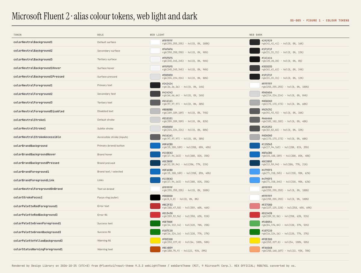
- Brand in web light: colorBrandBackground #0f6cbd, hover #115ea3, pressed #0c3b5e; text on brand #ffffff.
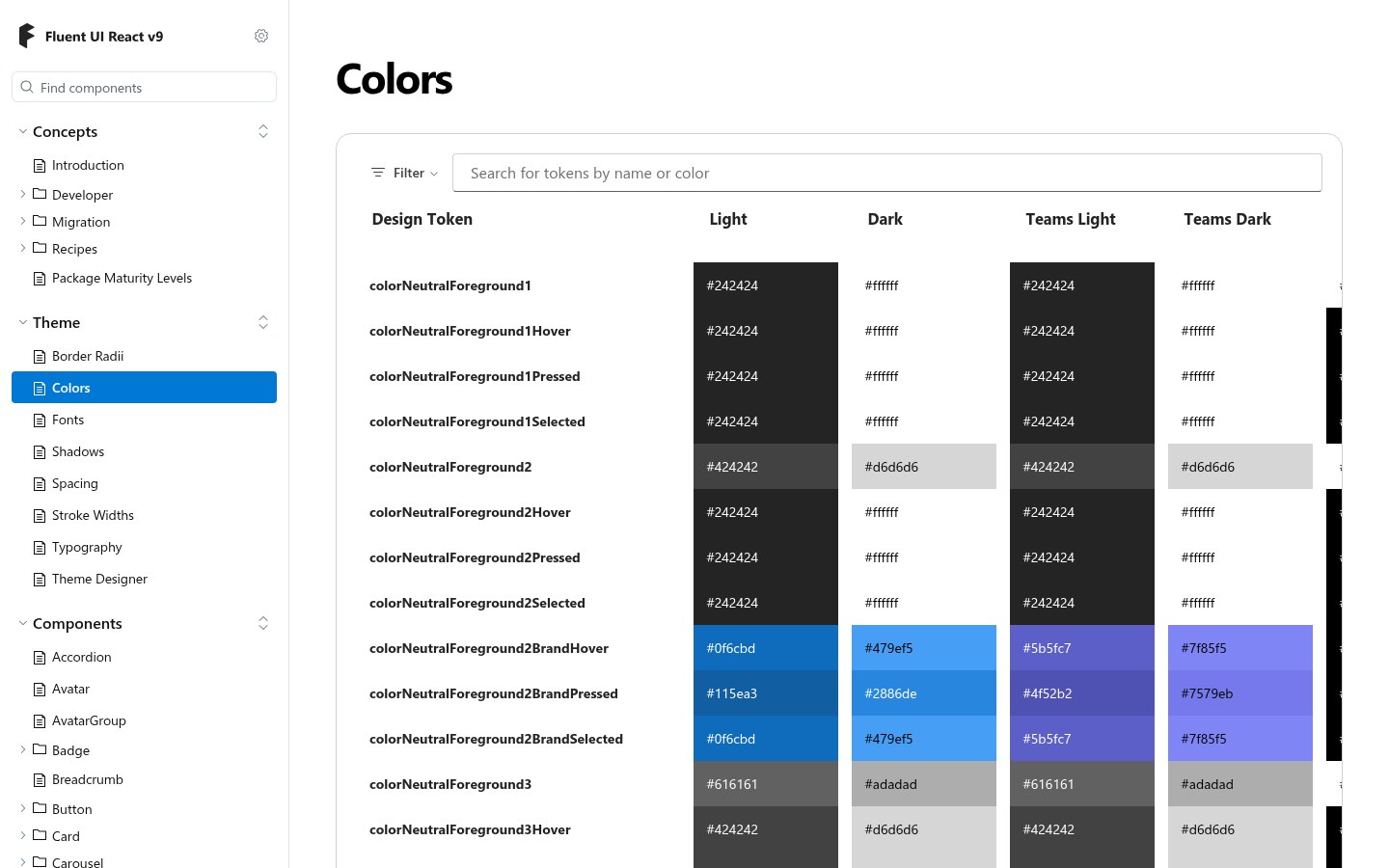
- The Storybook Theme section documents Border Radii, Colors, Fonts, Shadows, Spacing, Stroke Widths and Typography and includes a Theme Designer for custom brand ramps.
Source: storybooks.fluentui.dev/react/?path=/docs/theme-colors--docs
Typography, elevation and motion
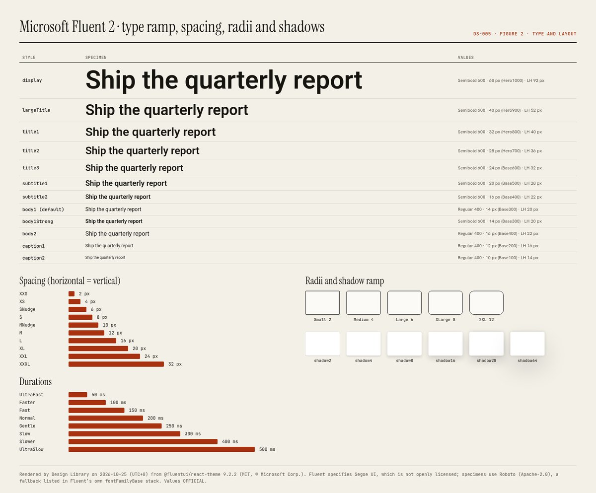
OFFICIAL- Type ramp from caption2 (10/14 px) to display (68/92 px); body1 14/20 px is the default; titles and subtitles are Semibold.
- Font stack: Segoe UI, Segoe UI Web (West European), -apple-system, BlinkMacSystemFont, Roboto, Helvetica Neue, sans-serif.
- Shadow ramp shadow2…shadow64: each pairs an ambient 2–8 px blur at 12% black with a key shadow at 14% black.
- Durations 50–500 ms; curves include easyEase (0.33,0,0.67,1) and decelerateMid (0,0,0,1).
Components and states
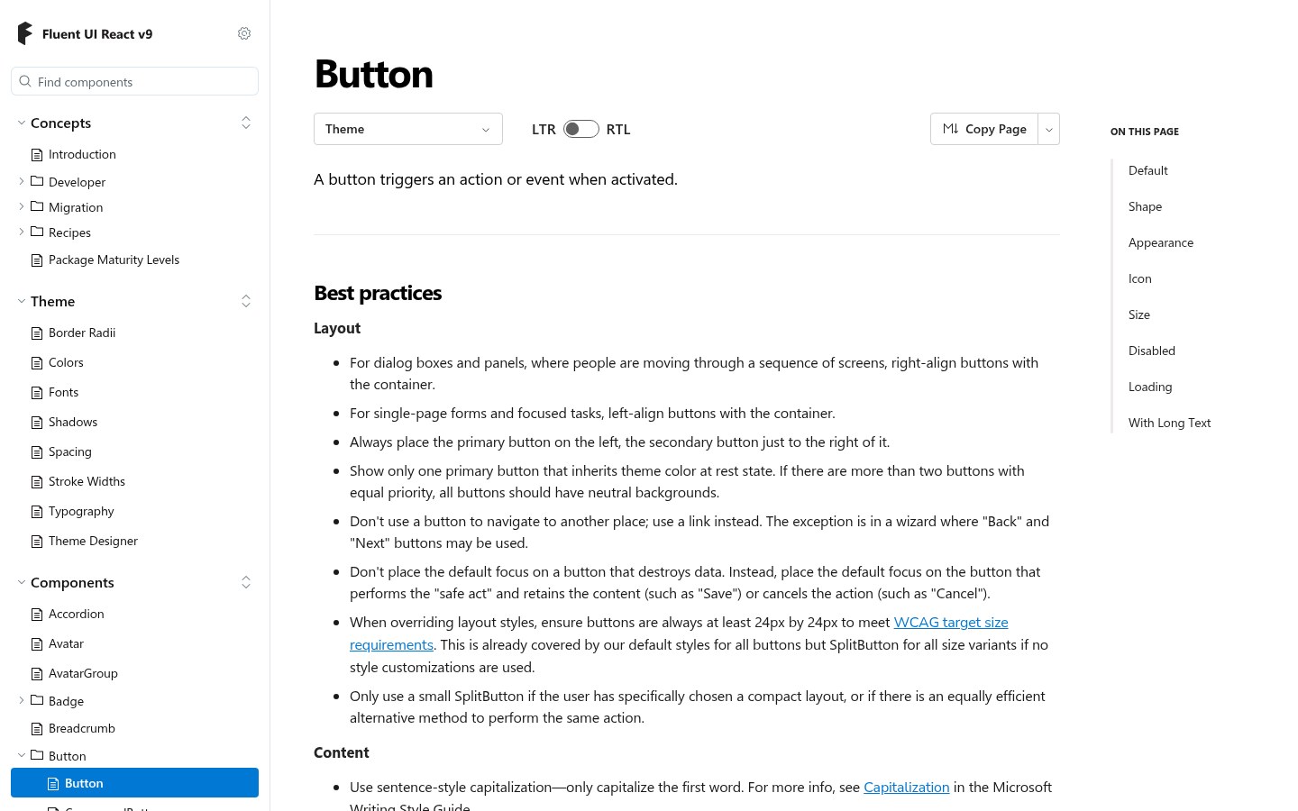
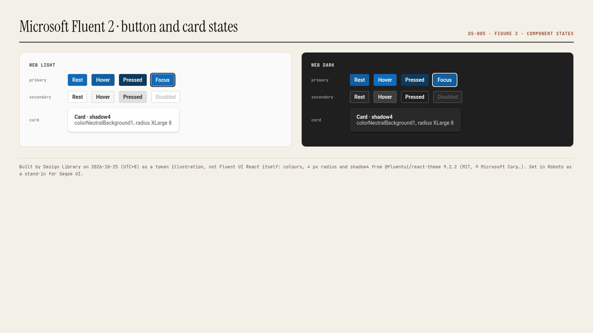
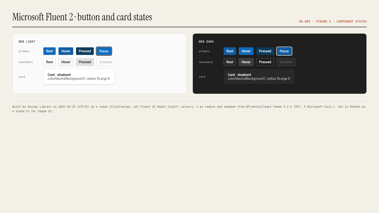
OFFICIAL- Button appearances: secondary (default), primary, outline, subtle and transparent; sizes small, medium, large; shapes rounded, circular, square; icon-only and icon-position options; disabled and disabledFocusable states (Fluent UI React v9 Button props).
- Each token has rest, hover, pressed and selected variants (e.g. colorNeutralBackground1Hover #f5f5f5, Pressed #e0e0e0).
- Focus uses a two-colour ring (colorStrokeFocus1/2) so it stays visible on any background.
Source: storybooks.fluentui.dev/react/?path=/docs/components-button-button--docs
Contrast checks we ran
ESTIMATED- colorNeutralForeground1 on Background1: light 15.52:1, dark 14.55:1.
- colorNeutralForeground3 (tertiary text) on white: 6.19:1.
- White on colorBrandBackground #0f6cbd: 5.38:1.
- colorNeutralForegroundDisabled #bdbdbd on white: 1.88:1; disabled text is exempt from WCAG contrast, but don’t use this colour for anything readable.
Documentation site UX
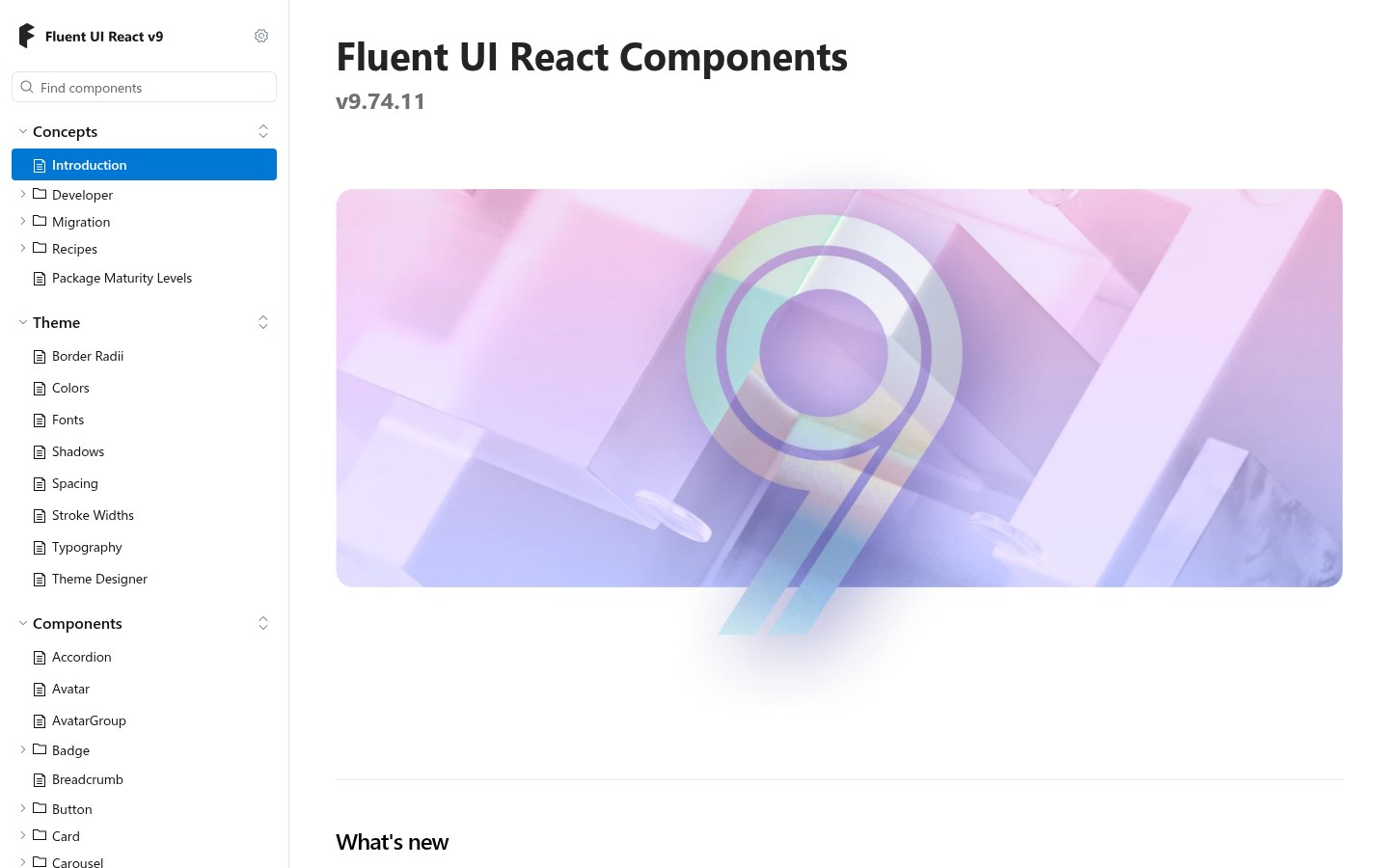
OURS- The Storybook doubles as the docs: a left tree (Concepts, Theme, Components, Compat and Preview Components, Motion, Utilities) with live, editable stories and a props table under each.
- Live stories make state coverage easy to check; the trade-off is weaker narrative guidance than Carbon or Primer, which lives on fluent2.design.
Source: storybooks.fluentui.dev/react/
Lessons to take
OURS- Ship themes as data so products can swap brands without touching components.
- Generate hover/pressed/selected from the brand ramp instead of hand-picking them.
- If your brand font can’t be shipped, design and test with the fallback that most users will actually see.
Source: storybooks.fluentui.dev/react/
Palette preview
Quick links
Usage terms at a glance
Our plain-language summary of the license recorded above, as of 2026-10-25. Not legal advice: always read the source’s own terms before shipping.
- Commercial use
- Yes for code: Fluent UI React and @fluentui/react-theme are MIT. Fonts and icons referenced in Fluent UI React are governed by Microsoft’s assets licence (aka.ms/fluentui-assets-license); Segoe UI is not open, while the microsoft/fluentui-system-icons repo is MIT
- Attribution
- Keep the MIT notice. Read the assets licence before bundling fonts or icons
- Redistribution
- Code yes (MIT); Segoe UI no; Fluent UI System Icons MIT (check the licence of the package you install)
- How you get it
- npm (@fluentui/react-components, @fluentui/web-components), Figma (Fluent 2 Web kit), GitHub
How to use
npm install @fluentui/react-components
import { FluentProvider, webLightTheme, Button, tokens } from '@fluentui/react-components';
<FluentProvider theme={webLightTheme}>
  <Button appearance="primary">Save</Button>
</FluentProvider>
// in makeStyles: { color: tokens.colorNeutralForeground1 }
Reference capture
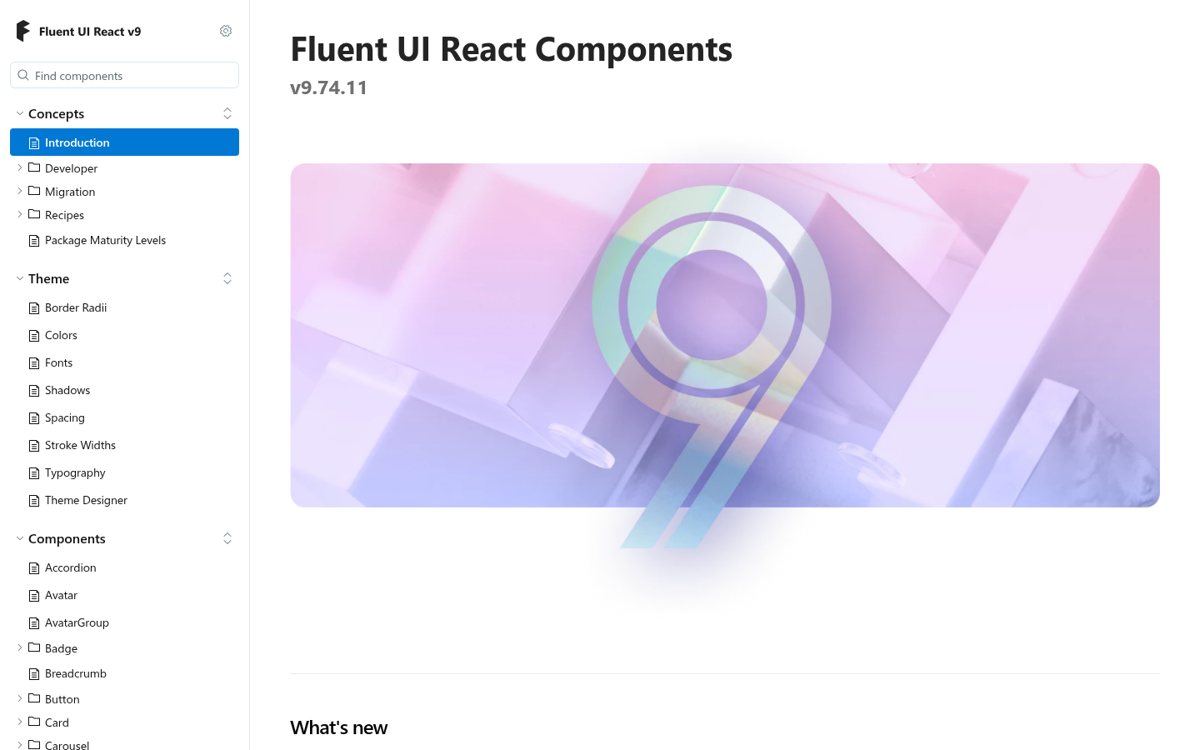
What the source looked like when we analysed it. A fair-use page capture taken by this library; the site, its artwork and marks belong to their owner, and no asset files are redistributed here.
Figures
Rendered by Design Library on 2026-10-25 (UTC+8) from the official npm token packages (licence named in each caption); the button/card panels are our token illustrations, not the system’s own component code.
Related entries
Picked by us (OURS) for what you’ll want next after this entry, with the reason for each.
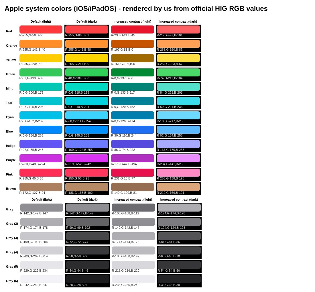
Apple Human Interface Guidelines
Why: Apple HIG is the other platform-owner system; both lean on a proprietary system font.
IBM Carbon Design System
Why: Carbon is the flat, grid-strict counterpart to Fluent’s soft, shadowed surfaces.
GitHub Primer
Why: Primer’s light/dark functional tokens map closely to Fluent’s neutral alias tokens.
Notion
Why: Notion’s site shows a similar calm, neutral productivity aesthetic.
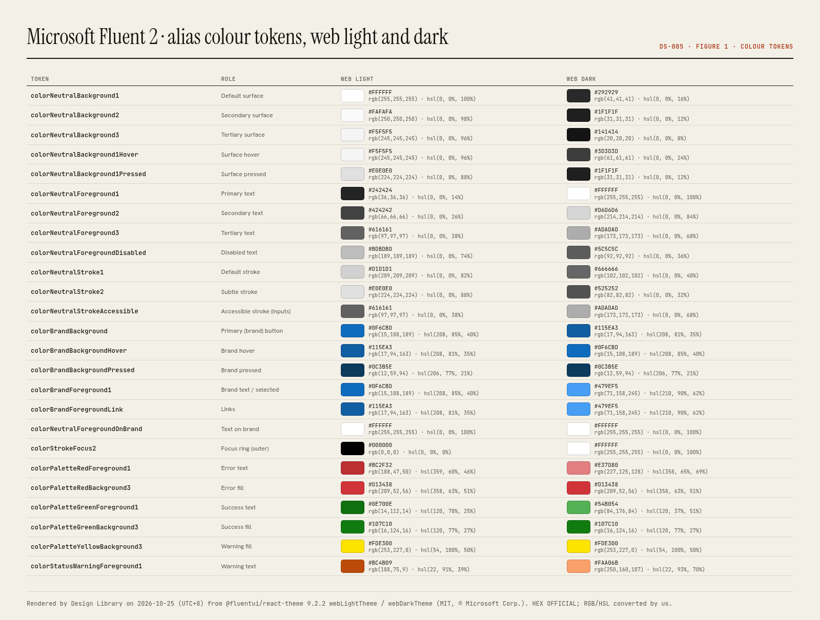
Alias colour tokens (web light / web dark)
OFFICIAL values from @fluentui/react-theme 9.2.2 (MIT, © Microsoft), objects webLightTheme and webDarkTheme, which Fluent UI React v9 documents in its public Storybook (Theme › Colors). fluent2.design itself refused TLS connections from our box on 2026-10-25.
Swatch order: Light → Dark
Light: #ffffffDark: #292929Light: #fafafaDark: #1f1f1fLight: #f5f5f5Dark: #141414Light: #f5f5f5Dark: #3d3d3dLight: #e0e0e0Dark: #1f1f1fLight: #242424Dark: #ffffffLight: #424242Dark: #d6d6d6Light: #616161Dark: #adadadLight: #bdbdbdDark: #5c5c5cLight: #d1d1d1Dark: #666666Light: #e0e0e0Dark: #525252Light: #616161Dark: #adadadLight: #0f6cbdDark: #115ea3Light: #115ea3Dark: #0f6cbdLight: #0c3b5eDark: #0c3b5eLight: #0f6cbdDark: #479ef5Light: #115ea3Dark: #479ef5Light: #ffffffDark: #ffffffLight: #000000Dark: #ffffffLight: #bc2f32Dark: #e37d80Light: #d13438Dark: #d13438Light: #0e700eDark: #54b054Light: #107c10Dark: #107c10Light: #fde300Dark: #fde300Light: #bc4b09Dark: #faa06bDominant palette from our captures
Measured by us from our screenshot(s) of https://fluent2.design/ (median-cut quantization; share = % of pixels). Approximate and not official.
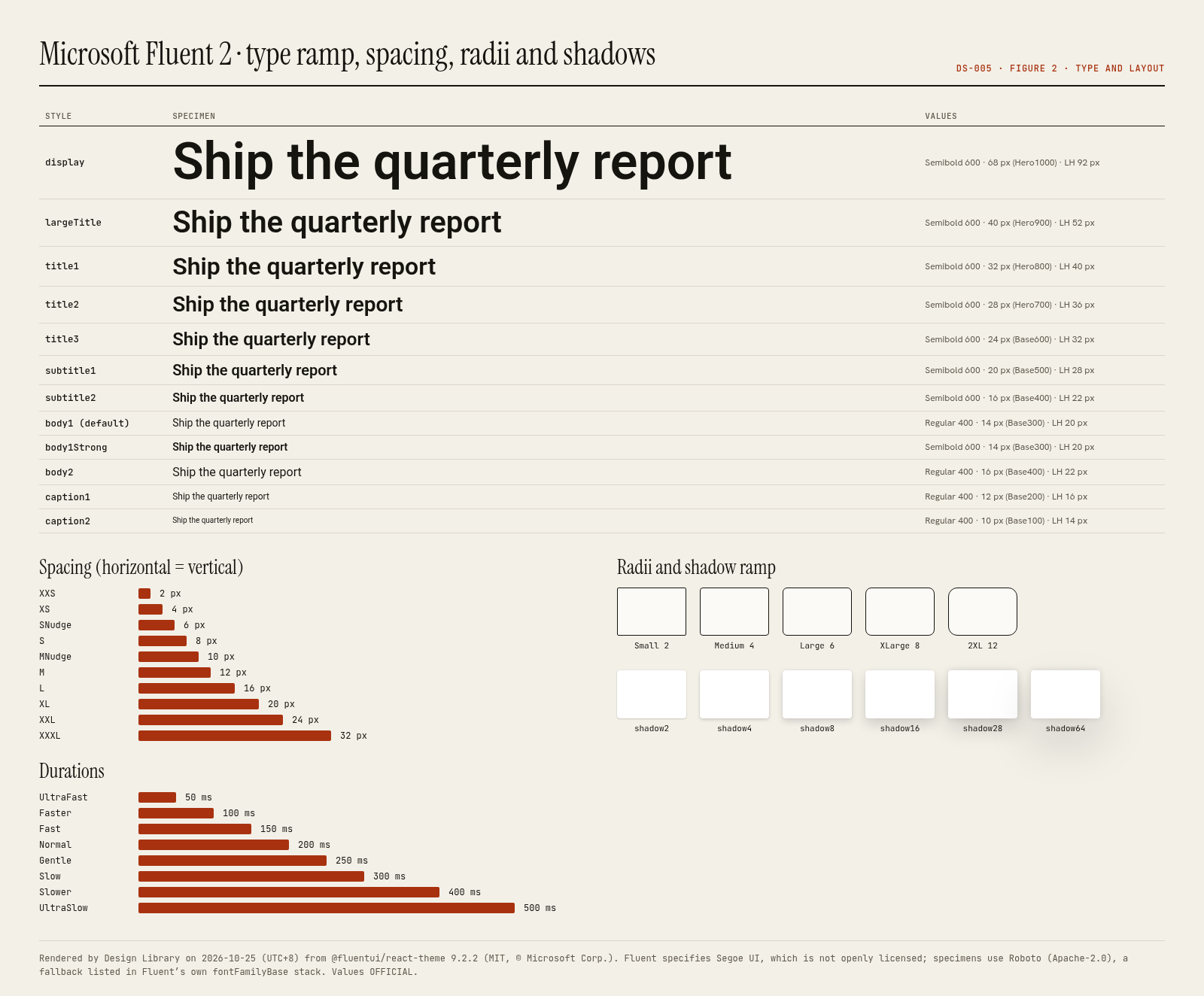
Fluent type ramp (typographyStyles; Segoe UI, then -apple-system, BlinkMacSystemFont, Roboto, Helvetica Neue)
Specimens use this site’s body font (Hanken Grotesk) at the official size and weight, as a stand-in for the system’s own typeface.
Layout pattern: Documentation
Observed by us on the captured page(s). See all entries by layout.
How to apply it: Use a left nav tree, a readable center column and an on-page table of contents.
Other entries with this layout: Apple Human Interface Guidelines, Spotify brand & design guidelines, Vercel brand assets (Geist), DiceBear · Lorelei, DiceBear · Notionists (Notion-style avatars), Anthropic ‘frontend-design’ skill, NES.css, 98.css + XP.css, RPGUI, Pixel fonts: Press Start 2P, Pixelify Sans, Silkscreen, VT323, IBM Carbon Design System, GitHub Primer, Flowbite (free, open-source).
Spacing, shape and other values
Gaps: Breakpoints and a column grid are not part of @fluentui/react-theme; Segoe UI is not openly licensed, so our specimens use Roboto, a fallback listed in Fluent’s own font stack.
Components
Documented by the design system (from the research PDF).
- Button, CompoundButton, SplitButton, ToggleButton, MenuButton
- Accordion
- Avatar, AvatarGroup, Persona
- Badge, CounterBadge, PresenceBadge
- Card
- Checkbox, Radio, Switch
- Combobox, Dropdown, Select
- DataGrid, Table
- Dialog, Drawer
- Field, Input, Textarea, SpinButton
- Link
- Menu
- MessageBar, Toast
- Popover, Tooltip
- ProgressBar, Spinner, Skeleton
- Slider
- TabList
- Tag, TagPicker
- Toolbar
- Tree
Our analysis
Fluent 2 is the design language of Microsoft 365, Teams and Windows, and Fluent UI React v9 is its web implementation. Instead of Carbon’s flat layers it uses soft elevation: a six-step shadow ramp (shadow2 to shadow64) that pairs an ambient 2–8 px blur with a key shadow, a radius scale whose everyday steps are 2, 4, 6 and 8 px, and a neutral palette that steps from colorNeutralBackground1 to 6. Colour is split into a brand ramp (Communication Blue, #0f6cbd as colorBrandBackground in web light) and neutral and status palettes, all exposed as alias tokens you consume through FluentProvider and the tokens object, so a theme is a plain object you can swap. The type ramp runs from caption2 (10/14 px) to display (68/92 px), with 14/20 px body1 as the default, in Segoe UI, which is not openly licensed: on the web, Fluent falls back to the system stack. Lessons: expose themes as data, keep one brand ramp and derive hover/pressed from it, use elevation sparingly and consistently, and plan a font fallback when the brand font cannot be shipped.
Similar to this
Ranked by shared category, type, industry sector and UX patterns first, then colour theme, layout and mood. Curated picks with reasons are on the Overview tab.
Downloads
PDF: research notes made for this library; third-party images inside follow the credits in their captions. License / terms of the source: MIT (Fluent UI code and @fluentui/react-theme, © Microsoft Corp.); fonts and icons referenced in Fluent UI React fall under Microsoft’s assets licence per the README (Segoe UI is not open); the Fluent UI System Icons repo itself is MIT
DESIGN.md for AI coding agents
Copy this into your repo or agent context. OFFICIAL and ESTIMATED values are labelled.
# DESIGN.md · Microsoft Fluent 2 (DS-005)

> Written for AI coding agents. Values marked **OFFICIAL** come from the documented source named below; values marked **ESTIMATED** were measured by us from our own screenshots and are approximate. Never treat ESTIMATED values as official brand tokens.

## Overview
- Type: Design System · Category: C. Design Systems
- Platforms: Web, React, Windows, iOS, Android, Figma
- Color theme: Monochrome light · Layout pattern: Documentation · Mood: Soft, approachable, productive
- License / terms: MIT (Fluent UI code and @fluentui/react-theme, © Microsoft Corp.); fonts and icons referenced in Fluent UI React fall under Microsoft’s assets licence per the README (Segoe UI is not open); the Fluent UI System Icons repo itself is MIT
- Industry: Platform design system
- Patterns: Docs sidebar, Live component demo

Microsoft’s cross-platform design system behind Microsoft 365. Fluent UI React v9 ships alias tokens (colorNeutralBackground1, colorBrandBackground…) for web light/dark, a 10–68 px type ramp in Segoe UI, a six-step shadow ramp (shadow2–shadow64), a 2–40 px radius scale and 50–500 ms motion. fluent2.design was unreachable from our box, so evidence comes from the official Storybook and npm package.

### Analysis (ours)
Fluent 2 is the design language of Microsoft 365, Teams and Windows, and Fluent UI React v9 is its web implementation. Instead of Carbon’s flat layers it uses soft elevation: a six-step shadow ramp (shadow2 to shadow64) that pairs an ambient 2–8 px blur with a key shadow, a radius scale whose everyday steps are 2, 4, 6 and 8 px, and a neutral palette that steps from colorNeutralBackground1 to 6. Colour is split into a brand ramp (Communication Blue, #0f6cbd as colorBrandBackground in web light) and neutral and status palettes, all exposed as alias tokens you consume through FluentProvider and the tokens object, so a theme is a plain object you can swap. The type ramp runs from caption2 (10/14 px) to display (68/92 px), with 14/20 px body1 as the default, in Segoe UI, which is not openly licensed: on the web, Fluent falls back to the system stack. Lessons: expose themes as data, keep one brand ramp and derive hover/pressed from it, use elevation sparingly and consistently, and plan a font fallback when the brand font cannot be shipped.

### Best practices (ours)
- Wrap the app in FluentProvider and read colours, spacing and type from the tokens object; never hard-code HEX values.
- Derive a custom brand from a 16-step brand ramp so hover, pressed and selected states stay consistent.
- Use the shadow ramp sparingly: shadow2–4 for cards at rest, shadow16–28 for flyouts, shadow64 for dialogs.
- Keep body text at body1 (14/20 px) and use the type styles (typographyStyles) rather than setting sizes manually.
- Plan a font fallback: Segoe UI can’t be bundled freely, so test the system stack on macOS and Linux.
- Use durationFast–durationNormal (150–200 ms) for state changes and keep slow durations for large surfaces.
- Respect colorStrokeFocus2 focus rings and high-contrast mode; don’t remove outlines.

### Deep analysis
Values marked OFFICIAL come from the cited official docs page or the official npm token package installed 2026-10-25 (UTC+8) (@carbon/themes 11.78.0, @carbon/type 11.70.0, @carbon/layout 11.62.0, @carbon/motion 11.55.0, @primer/primitives 11.10.0, @fluentui/react-theme 9.2.2). ESTIMATED values were computed or observed by us that day (WCAG 2 contrast ratios, what our captures show). OURS is our interpretation.

#### Purpose and audience (OFFICIAL) · source: https://github.com/microsoft/fluentui
- “Fluent UI web represents a collection of utilities, React components, and web components for building web applications” (microsoft/fluentui README). Fluent 2 is the design language behind Microsoft 365, Teams and Windows.
- Licence: “MIT license … Usage of the fonts and icons referenced in Fluent UI React is subject to the terms of the assets license agreement.”
- fluent2.design (design guidance site) could not be reached from our box on 2026-10-25 (TLS connection closed), so this entry cites the official Storybook, GitHub README and npm package instead.

#### Theme and colour model (OFFICIAL) · source: https://storybooks.fluentui.dev/react/?path=/docs/theme-colors--docs
- Themes are plain objects (webLightTheme, webDarkTheme, teamsLightTheme, teamsDarkTheme, teamsHighContrastTheme) passed to FluentProvider; components read alias tokens via the tokens object.
- Alias tokens are grouped as neutral (backgrounds 1–6, foregrounds 1–4, strokes), brand (from a 16-step brand ramp) and palette/status (red, green, yellow…).
- Brand in web light: colorBrandBackground #0f6cbd, hover #115ea3, pressed #0c3b5e; text on brand #ffffff.
- The Storybook Theme section documents Border Radii, Colors, Fonts, Shadows, Spacing, Stroke Widths and Typography and includes a Theme Designer for custom brand ramps.

#### Typography, elevation and motion (OFFICIAL) · source: https://www.npmjs.com/package/@fluentui/react-theme
- Type ramp from caption2 (10/14 px) to display (68/92 px); body1 14/20 px is the default; titles and subtitles are Semibold.
- Font stack: Segoe UI, Segoe UI Web (West European), -apple-system, BlinkMacSystemFont, Roboto, Helvetica Neue, sans-serif.
- Shadow ramp shadow2…shadow64: each pairs an ambient 2–8 px blur at 12% black with a key shadow at 14% black.
- Durations 50–500 ms; curves include easyEase (0.33,0,0.67,1) and decelerateMid (0,0,0,1).

#### Components and states (OFFICIAL) · source: https://storybooks.fluentui.dev/react/?path=/docs/components-button-button--docs
- Button appearances: secondary (default), primary, outline, subtle and transparent; sizes small, medium, large; shapes rounded, circular, square; icon-only and icon-position options; disabled and disabledFocusable states (Fluent UI React v9 Button props).
- Each token has rest, hover, pressed and selected variants (e.g. colorNeutralBackground1Hover #f5f5f5, Pressed #e0e0e0).
- Focus uses a two-colour ring (colorStrokeFocus1/2) so it stays visible on any background.

#### Contrast checks we ran (ESTIMATED) · source: https://www.npmjs.com/package/@fluentui/react-theme
- colorNeutralForeground1 on Background1: light 15.52:1, dark 14.55:1.
- colorNeutralForeground3 (tertiary text) on white: 6.19:1.
- White on colorBrandBackground #0f6cbd: 5.38:1.
- colorNeutralForegroundDisabled #bdbdbd on white: 1.88:1; disabled text is exempt from WCAG contrast, but don’t use this colour for anything readable.

#### Documentation site UX (OURS) · source: https://storybooks.fluentui.dev/react/
- The Storybook doubles as the docs: a left tree (Concepts, Theme, Components, Compat and Preview Components, Motion, Utilities) with live, editable stories and a props table under each.
- Live stories make state coverage easy to check; the trade-off is weaker narrative guidance than Carbon or Primer, which lives on fluent2.design.

#### Lessons to take (OURS) · source: https://storybooks.fluentui.dev/react/
- Ship themes as data so products can swap brands without touching components.
- Generate hover/pressed/selected from the brand ramp instead of hand-picking them.
- If your brand font can’t be shipped, design and test with the fallback that most users will actually see.

### Usage terms at a glance (our summary, not legal advice)
- Commercial use: Yes for code: Fluent UI React and @fluentui/react-theme are MIT. Fonts and icons referenced in Fluent UI React are governed by Microsoft’s assets licence (aka.ms/fluentui-assets-license); Segoe UI is not open, while the microsoft/fluentui-system-icons repo is MIT
- Attribution: Keep the MIT notice. Read the assets licence before bundling fonts or icons
- Redistribution: Code yes (MIT); Segoe UI no; Fluent UI System Icons MIT (check the licence of the package you install)
- How you get it: npm (@fluentui/react-components, @fluentui/web-components), Figma (Fluent 2 Web kit), GitHub

## Color tokens
OFFICIAL · Alias colour tokens (web light / web dark). OFFICIAL values from @fluentui/react-theme 9.2.2 (MIT, © Microsoft), objects webLightTheme and webDarkTheme, which Fluent UI React v9 documents in its public Storybook (Theme › Colors). fluent2.design itself refused TLS connections from our box on 2026-10-25.

| Role | Light | Dark |
|---|---|---|
| colorNeutralBackground1 · Default surface | `#ffffff` | `#292929` |
| colorNeutralBackground2 · Secondary surface | `#fafafa` | `#1f1f1f` |
| colorNeutralBackground3 · Tertiary surface | `#f5f5f5` | `#141414` |
| colorNeutralBackground1Hover · Surface hover | `#f5f5f5` | `#3d3d3d` |
| colorNeutralBackground1Pressed · Surface pressed | `#e0e0e0` | `#1f1f1f` |
| colorNeutralForeground1 · Primary text | `#242424` | `#ffffff` |
| colorNeutralForeground2 · Secondary text | `#424242` | `#d6d6d6` |
| colorNeutralForeground3 · Tertiary text | `#616161` | `#adadad` |
| colorNeutralForegroundDisabled · Disabled text | `#bdbdbd` | `#5c5c5c` |
| colorNeutralStroke1 · Default stroke | `#d1d1d1` | `#666666` |
| colorNeutralStroke2 · Subtle stroke | `#e0e0e0` | `#525252` |
| colorNeutralStrokeAccessible · Accessible stroke (inputs) | `#616161` | `#adadad` |
| colorBrandBackground · Primary (brand) button | `#0f6cbd` | `#115ea3` |
| colorBrandBackgroundHover · Brand hover | `#115ea3` | `#0f6cbd` |
| colorBrandBackgroundPressed · Brand pressed | `#0c3b5e` | `#0c3b5e` |
| colorBrandForeground1 · Brand text / selected | `#0f6cbd` | `#479ef5` |
| colorBrandForegroundLink · Links | `#115ea3` | `#479ef5` |
| colorNeutralForegroundOnBrand · Text on brand | `#ffffff` | `#ffffff` |
| colorStrokeFocus2 · Focus ring (outer) | `#000000` | `#ffffff` |
| colorPaletteRedForeground1 · Error text | `#bc2f32` | `#e37d80` |
| colorPaletteRedBackground3 · Error fill | `#d13438` | `#d13438` |
| colorPaletteGreenForeground1 · Success text | `#0e700e` | `#54b054` |
| colorPaletteGreenBackground3 · Success fill | `#107c10` | `#107c10` |
| colorPaletteYellowBackground3 · Warning fill | `#fde300` | `#fde300` |
| colorStatusWarningForeground1 · Warning text | `#bc4b09` | `#faa06b` |

ESTIMATED · dominant colors measured from our screenshot(s) of the source site (median-cut quantization; share = % of pixels). Approximate, not official:

- `#FFFFFF` ~67%
- `#EBD6F5` ~5%
- `#A3ACC5` ~5%
- `#CAB9DC` ~4%
- `#2E2E35` ~4%
- `#5A7BB3` ~3%

## Typography
OFFICIAL · Fluent type ramp (typographyStyles; Segoe UI, then -apple-system, BlinkMacSystemFont, Roboto, Helvetica Neue)

| Style | Weight | Size | Line height | Tracking |
|---|---|---|---|---|
| display | Semibold | 68 px (Hero1000) | 92 px | — |
| largeTitle | Semibold | 40 px (Hero900) | 52 px | — |
| title1 | Semibold | 32 px (Hero800) | 40 px | — |
| title2 | Semibold | 28 px (Hero700) | 36 px | — |
| title3 | Semibold | 24 px (Base600) | 32 px | — |
| subtitle1 | Semibold | 20 px (Base500) | 28 px | — |
| subtitle2 | Semibold | 16 px (Base400) | 22 px | — |
| body1 (default) | Regular | 14 px (Base300) | 20 px | — |
| body1Strong | Semibold | 14 px (Base300) | 20 px | — |
| body2 | Regular | 16 px (Base400) | 22 px | — |
| caption1 | Regular | 12 px (Base200) | 16 px | — |
| caption2 | Regular | 10 px (Base100) | 14 px | — |

## Spacing, radii, shadows
- OFFICIAL · Spacing (horizontal = vertical): None 0 · XXS 2 · XS 4 · SNudge 6 · S 8 · MNudge 10 · M 12 · L 16 · XL 20 · XXL 24 · XXXL 32 px
- OFFICIAL · Border radius: None 0 · Small 2 · Medium 4 · Large 6 · XLarge 8 · 2XL 12 · 3XL 16 · 4XL 24 · 5XL 32 · 6XL 40 px · Circular
- OFFICIAL · Stroke widths: Thin 1 · Thick 2 · Thicker 3 · Thickest 4 px
- OFFICIAL · Shadow ramp (light): shadow2: 0 0 2px rgba(0,0,0,0.12), 0 1px 2px rgba(0,0,0,0.14) · shadow4: 0 0 2px rgba(0,0,0,0.12), 0 2px 4px rgba(0,0,0,0.14) · shadow8: 0 0 2px rgba(0,0,0,0.12), 0 4px 8px rgba(0,0,0,0.14) · shadow16: 0 0 2px rgba(0,0,0,0.12), 0 8px 16px rgba(0,0,0,0.14) · shadow28: 0 0 8px rgba(0,0,0,0.12), 0 14px 28px rgba(0,0,0,0.14) · shadow64: 0 0 8px rgba(0,0,0,0.12), 0 32px 64px rgba(0,0,0,0.14)
- OFFICIAL · Durations: UltraFast 50 · Faster 100 · Fast 150 · Normal 200 · Gentle 250 · Slow 300 · Slower 400 · UltraSlow 500 ms
- OFFICIAL · Curves: EasyEase (0.33,0,0.67,1) · DecelerateMid (0,0,0,1) · AccelerateMid (1,0,1,1) · EasyEaseMax (0.8,0,0.2,1) · Linear
- OFFICIAL · Font families: Base: Segoe UI stack · Monospace: Consolas, Courier New · Numeric: Bahnschrift, Segoe UI
- OFFICIAL · Weights: Regular 400 · Medium 500 · Semibold 600 · Bold 700
- Gaps (not documented / not verified): Breakpoints and a column grid are not part of @fluentui/react-theme; Segoe UI is not openly licensed, so our specimens use Roboto, a fallback listed in Fluent’s own font stack.

## Components
- Button, CompoundButton, SplitButton, ToggleButton, MenuButton
- Accordion
- Avatar, AvatarGroup, Persona
- Badge, CounterBadge, PresenceBadge
- Card
- Checkbox, Radio, Switch
- Combobox, Dropdown, Select
- DataGrid, Table
- Dialog, Drawer
- Field, Input, Textarea, SpinButton
- Link
- Menu
- MessageBar, Toast
- Popover, Tooltip
- ProgressBar, Spinner, Skeleton
- Slider
- TabList
- Tag, TagPicker
- Toolbar
- Tree

## Layout rules
- Observed layout pattern: **Documentation** (from our captures).

## Usage
```
npm install @fluentui/react-components
import { FluentProvider, webLightTheme, Button, tokens } from '@fluentui/react-components';
<FluentProvider theme={webLightTheme}>
  <Button appearance="primary">Save</Button>
</FluentProvider>
// in makeStyles: { color: tokens.colorNeutralForeground1 }
```

## Do’s and don’ts
- Do: Keep chrome neutral and let content (images, icons, type) carry color.
- Don’t: Don’t introduce decorative color that competes with content.
- Do: follow the source’s license/terms listed above.
- Don’t: present ESTIMATED colors as official tokens.

## Related entries (ours)
- DS-002: Apple HIG is the other platform-owner system; both lean on a proprietary system font. · https://design-library-byt.pages.dev/entry/DS-002
- DS-003: Carbon is the flat, grid-strict counterpart to Fluent’s soft, shadowed surfaces. · https://design-library-byt.pages.dev/entry/DS-003
- DS-004: Primer’s light/dark functional tokens map closely to Fluent’s neutral alias tokens. · https://design-library-byt.pages.dev/entry/DS-004
- WR-004: Notion’s site shows a similar calm, neutral productivity aesthetic. · https://design-library-byt.pages.dev/entry/WR-004

## Sources
- https://fluent2.design/
- Library entry: https://design-library-byt.pages.dev/entry/DS-005