Vercel brand assets (Geist)
Vercel’s public brand page within the Geist design system: logo files and usage. Tip: shipping brand assets inside the design system keeps logo and UI tokens in sync.
Summary
Vercel’s public brand page within the Geist design system: logo files and usage. Tip: shipping brand assets inside the design system keeps logo and UI tokens in sync.
What it is
A company’s public brand page: how its logo, color and type may be used.
Who it’s for
Designers learning how mature brands document identity, and anyone who must use that brand’s assets correctly.
Key takeaways
- Captured Vercel’s Geist brands page: a documentation layout with a left sidebar and the black Vercel logotype on a light panel.
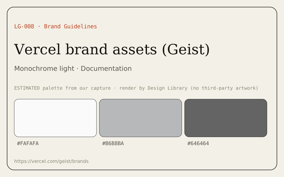
- Color: monochrome light theme; dominant colors #FAFAFA, #B6B8BA, #646464 (ESTIMATED from our capture).
- Layout: documentation pattern, minimal, technical mood.
Best practices to borrow
- Keep chrome neutral and let content carry color.
- Use a left nav tree, a readable center column and an on-page table of contents.
- Respect clear-space, minimum size and color rules when you use this brand’s assets.
Palette preview
Link-only entry: no third-party images are reproduced; the hero above is our own palette render. Open the source for visuals.
Dominant palette from our captures
Measured by us from our screenshot(s) of https://vercel.com/geist/brands (median-cut quantization; share = % of pixels). Approximate and not official.
Layout pattern: Documentation
Observed by us on the captured page(s). See all entries by layout.
How to apply it: Use a left nav tree, a readable center column and an on-page table of contents.
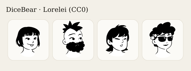
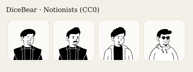
Other entries with this layout: Apple Human Interface Guidelines, Spotify brand & design guidelines, DiceBear · Lorelei, DiceBear · Notionists (Notion-style avatars), Anthropic ‘frontend-design’ skill.
Our analysis
Captured Vercel’s Geist brands page: a documentation layout with a left sidebar and the black Vercel logotype on a light panel.
Similar to this
Ranked by shared color theme, layout, category, type and mood tags.
DESIGN.md for AI coding agents
Copy this into your repo or agent context. OFFICIAL and ESTIMATED values are labelled.
# DESIGN.md · Vercel brand assets (Geist) (LG-008)

> Written for AI coding agents. Values marked **OFFICIAL** come from the documented source named below; values marked **ESTIMATED** were measured by us from our own screenshots and are approximate. Never treat ESTIMATED values as official brand tokens.

## Overview
- Type: Brand Guidelines · Category: H. Logos and Brand Identity
- Platforms: Web
- Color theme: Monochrome light · Layout pattern: Documentation · Mood: Minimal, technical
- License / terms: Vercel trademarks; link only

Vercel’s public brand page within the Geist design system: logo files and usage. Tip: shipping brand assets inside the design system keeps logo and UI tokens in sync.

### Analysis (ours)
Captured Vercel’s Geist brands page: a documentation layout with a left sidebar and the black Vercel logotype on a light panel.

## Color tokens
No official color tokens documented for this entry.

ESTIMATED · dominant colors measured from our screenshot(s) of the source site (median-cut quantization; share = % of pixels). Approximate, not official:

- `#FAFAFA` ~62%
- `#B6B8BA` ~3%
- `#646464` ~2%

## Typography
No official type scale documented for this entry; use the product’s own typography guidance.

## Spacing, radii, shadows
Not documented for this entry. Do not invent values; derive from your own design system.

## Components
No component inventory documented for this entry.

## Layout rules
- Observed layout pattern: **Documentation** (from our captures).

## Do’s and don’ts
- Do: Keep chrome neutral and let content (images, icons, type) carry color.
- Don’t: Don’t introduce decorative color that competes with content.
- Do: follow the source’s license/terms listed above.
- Don’t: present ESTIMATED colors as official tokens.

## Sources
- https://vercel.com/geist/brands
- Library entry: https://design-library-byt.pages.dev/entry/LG-008