IBM Carbon Design System
IBM’s open-source design system for enterprise products: four themes driven by role-based colour tokens and a layering model, IBM Plex type sets (productive 14 px / expressive 16 px base), the 8-px 2x Grid, a 2–160 px spacing scale, productive/expressive motion and React + Web Components libraries.
Summary
IBM’s open-source design system for enterprise products: four themes driven by role-based colour tokens and a layering model, IBM Plex type sets (productive 14 px / expressive 16 px base), the 8-px 2x Grid, a 2–160 px spacing scale, productive/expressive motion and React + Web Components libraries.
What it is
An official design system: documented foundations (color, type, layout) plus components and usage guidance.
Who it’s for
Product designers and front-end engineers building apps that should feel native to the platform, or teams studying a mature system before writing their own.
Key takeaways
- Carbon is IBM’s answer to building hundreds of enterprise products that must look like one family.
- Its core idea is the layering model: four themes (White, Gray 10, Gray 90, Gray 100) assign values to role-based tokens such as $background, $layer-01 and $border-subtle-01, and each nested container steps to the next layer, alternating White/Gray 10 in light themes and getting one step lighter per layer in dark themes.
- That replaces shadows with tone, which keeps dense dashboards calm and flat.
- Type is split into a productive set (14 px base, fixed headings, for task UIs) and an expressive set (16 px base, fluid headings, for web pages), all in IBM Plex.
- Everything snaps to the 8-px 2x Grid.
Best practices to borrow
- Pick one of the four themes per surface and use inline theming (e.g. a Gray 100 UI Shell over a White page) instead of inventing a fifth.
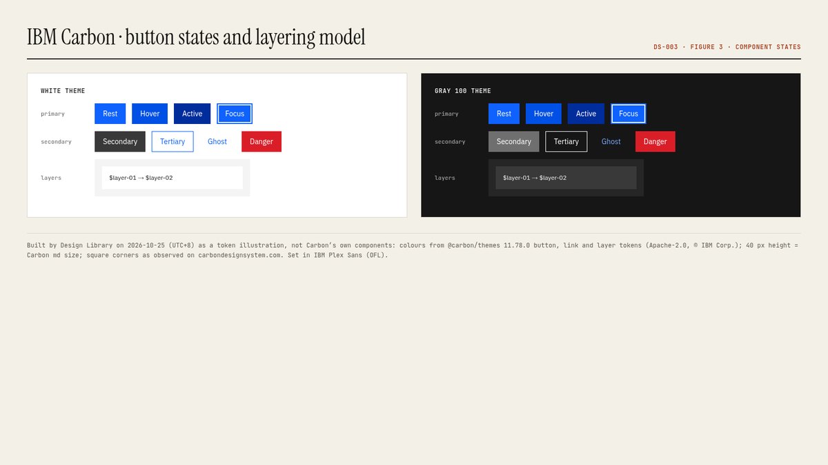
- Nest containers with the layering tokens ($layer-01 → $layer-02) instead of adding shadows; that is how Carbon keeps dense pages flat and readable.
- Use the productive type set (14 px base, fixed headings) inside products and the expressive set (16 px base, fluid headings) on marketing pages.
- Show one primary button per screen; Carbon’s guidance says primary buttons should only appear once per screen.
- Snap every size to the 8-px mini unit of the 2x Grid and use spacing tokens (2–160 px), never ad-hoc pixel values.
- Use productive motion (fast-01 70 ms to moderate-02 240 ms, standard productive easing) for most interactions and save expressive motion for significant moments.
- Check contrast whenever you change $interactive or a layer token; the four themes ship pre-tested pairs.
- Keep chrome neutral and let content carry color.
- Use a left nav tree, a readable center column and an on-page table of contents.
- Adopt its tokens through variables, not hard-coded values, and follow its component guidance before customizing.
Deep dive
A structured read of the official docs and the official npm token packages, checked on 2026-10-25 (UTC+8). OFFICIAL = stated on the cited official page or read from the installed package (version named in each section); ESTIMATED = computed or observed by us (WCAG contrast ratios, what our captures show); OURS = our interpretation. Exact colour and type values are on the Colors and Typography tabs.
Purpose and audience
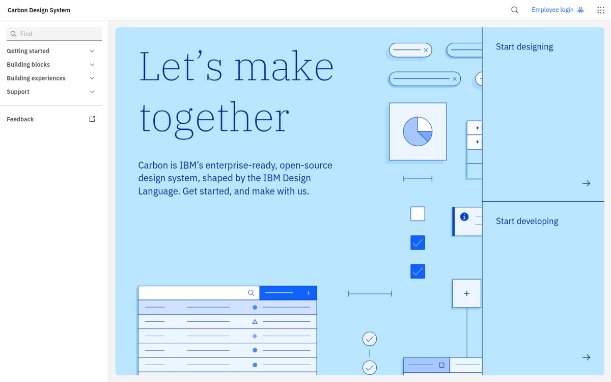
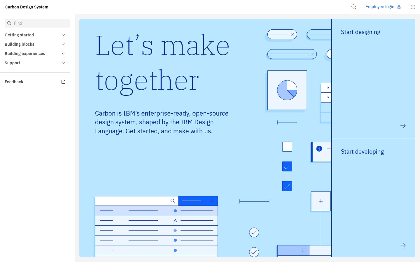
OFFICIAL- “Carbon is IBM’s enterprise-ready, open-source design system, shaped by the IBM Design Language” (carbondesignsystem.com home, 2026-10-25).
- Audience: designers and developers building IBM products and other dense enterprise software (data tables, consoles, dashboards); open to anyone under Apache-2.0.
- Delivery: React (@carbon/react) and Web Components (@carbon/web-components) libraries, Sass packages, Figma kits; the home page also promotes a Carbon MCP server and Carbon for AI guidance.
Source: carbondesignsystem.com/
Colour model: themes, tokens, layering
OFFICIAL- Four default themes named after their background: White and Gray 10 (light), Gray 90 and Gray 100 (dark). @carbon/react defaults to White.
- Terms: a theme assigns values; a token is a role-based identifier that never changes across themes; a role cannot change between themes; a value is the hex/rgba.
- Layering model: in light themes layers alternate White / Gray 10 with each nested layer; in dark themes each layer is one step lighter.
- Core blue (#0f62fe, Blue 60) is the primary action colour across IBM products; “additional colors are used sparingly and purposefully”.
- Five interaction states per token (hover, active, selected…) are separate tokens, e.g. $background-hover.
Source: carbondesignsystem.com/building-blocks/foundations/color/overview
Typography and grid
OFFICIAL- IBM Plex Sans/Serif/Mono (OFL). Two type sets: productive (14 px base, fixed headings, for dense product pages) and expressive (16 px base, fluid headings that change at breakpoints, for web pages).
- Productive styles end in -01, expressive in -02; utility styles cover code, labels/helper text and legal copy.
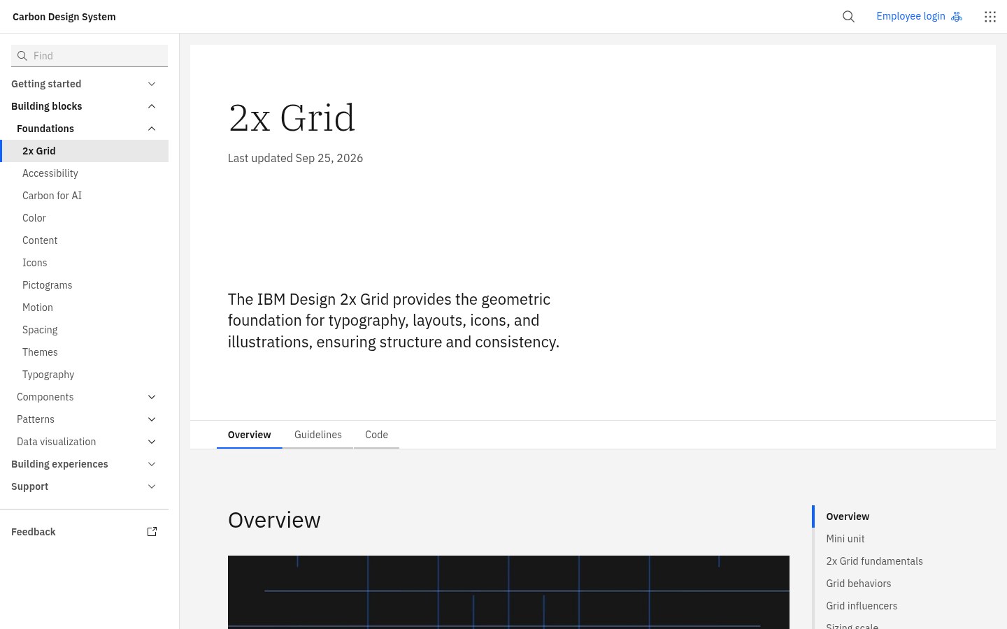
- 2x Grid: “The basic unit … is the 8-pixel square mini unit”; values divide or multiply by two; 16 columns at lg (1056 px) and above.
- Spacing scale $spacing-01…13 = 2 to 160 px, complementing the grid and type scale with multiples of 2, 4 and 8.
Source: carbondesignsystem.com/building-blocks/foundations/typography/type-sets
Components and states
OFFICIAL- Button variants: primary, secondary, tertiary, ghost and danger; “Primary buttons should only appear once per screen”. Seven sizes from extra small to 2XL (component heights 24–80 px in @carbon/layout).
- Don’t use buttons for navigation; use links when the action takes the user to a new page.
- States are tokenised: $button-primary #0f62fe, hover #0050e6, active #002d9c; focus uses the $focus token (#0f62fe in White/Gray 10, #ffffff in Gray 90/100).
- Notifications, tags and support colours use $support-error #da1e28, $support-success #24a148, $support-warning #f1c21b, $support-info #0043ce (White theme).
Contrast checks we ran
ESTIMATED- $text-primary on $background, White theme: 18.1:1; Gray 100: 16.45:1.
- $text-secondary on $background, White: 7.81:1; Gray 100: 10.59:1.
- $text-on-color on $button-primary: 5.0:1 (passes AA for normal text).
- $support-warning #f1c21b on White: 1.68:1, which is why Carbon pairs warning icons with dark glyphs rather than using the yellow for text.
Source: carbondesignsystem.com/building-blocks/foundations/color/tokens
Documentation site UX
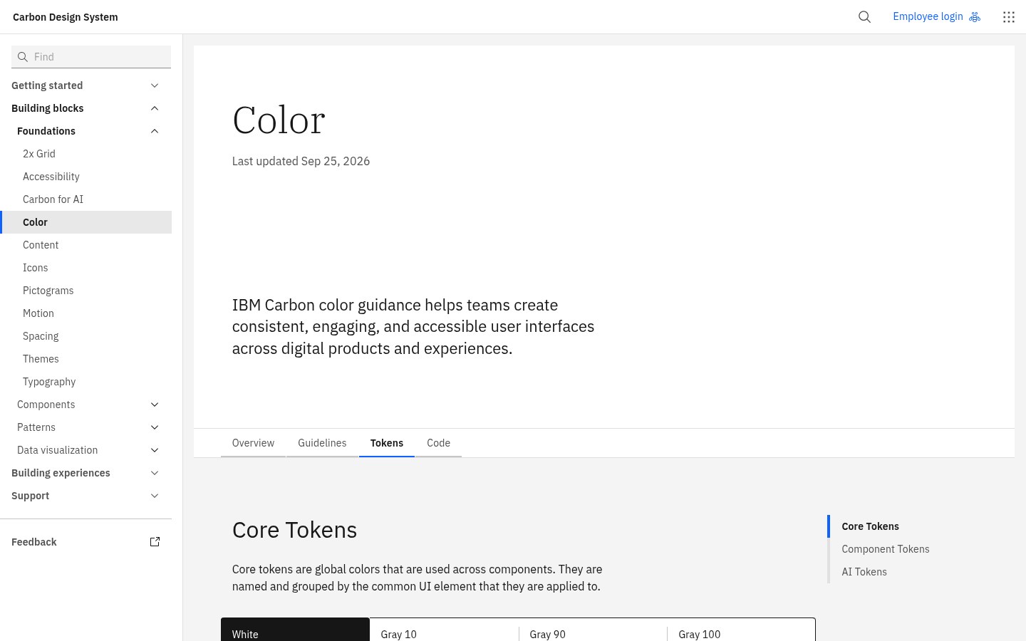
OURS- Top navigation (Getting started, Building blocks, Building experiences, Support) over a left sidebar tree, with Usage / Style / Code / Accessibility tabs on component pages; the 2026 site groups Foundations, Components, Patterns and Data visualization under ‘Building blocks’ and redirects old /elements/ URLs.
- Pages state their ‘Last updated’ date at the top (e.g. Color tokens: Sep 25, 2026), which helps judge freshness.
- Token tables show every theme side by side with copy buttons; good model for our own token docs.
Source: carbondesignsystem.com/
Lessons to take
OURS- Name tokens by role and keep the role fixed; only the values change between themes.
- In dense UIs, express hierarchy with tone (layers) instead of shadows.
- Split ‘productive’ and ‘expressive’ registers for type and motion rather than one compromise scale.
- Publish interaction states as tokens so hover/active colours don’t drift between teams.
Source: carbondesignsystem.com/
Palette preview
Quick links
Usage terms at a glance
Our plain-language summary of the license recorded above, as of 2026-10-25. Not legal advice: always read the source’s own terms before shipping.
- Commercial use
- Yes. Apache-2.0 allows commercial use of Carbon code; IBM Plex is OFL 1.1 (free, including commercial)
- Attribution
- Keep the Apache-2.0 licence and NOTICE with redistributed code; no UI credit required. Don’t use IBM logos or imply IBM endorsement
- Redistribution
- Code yes under Apache-2.0; fonts yes under OFL (not sold on their own); IBM trademarks no
- How you get it
- npm (@carbon/react, @carbon/web-components, @carbon/styles), Sass, Figma kits, GitHub
How to use
npm install @carbon/react   # or @carbon/web-components
// styles.scss
@use '@carbon/react';               // White theme by default
@use '@carbon/react/scss/themes';
@use '@carbon/react/scss/theme' with ($theme: themes.$g100);
// tokens in CSS: var(--cds-background), var(--cds-layer-01), var(--cds-interactive)
Reference capture
What the source looked like when we analysed it. A fair-use page capture taken by this library; the site, its artwork and marks belong to their owner, and no asset files are redistributed here.
Figures
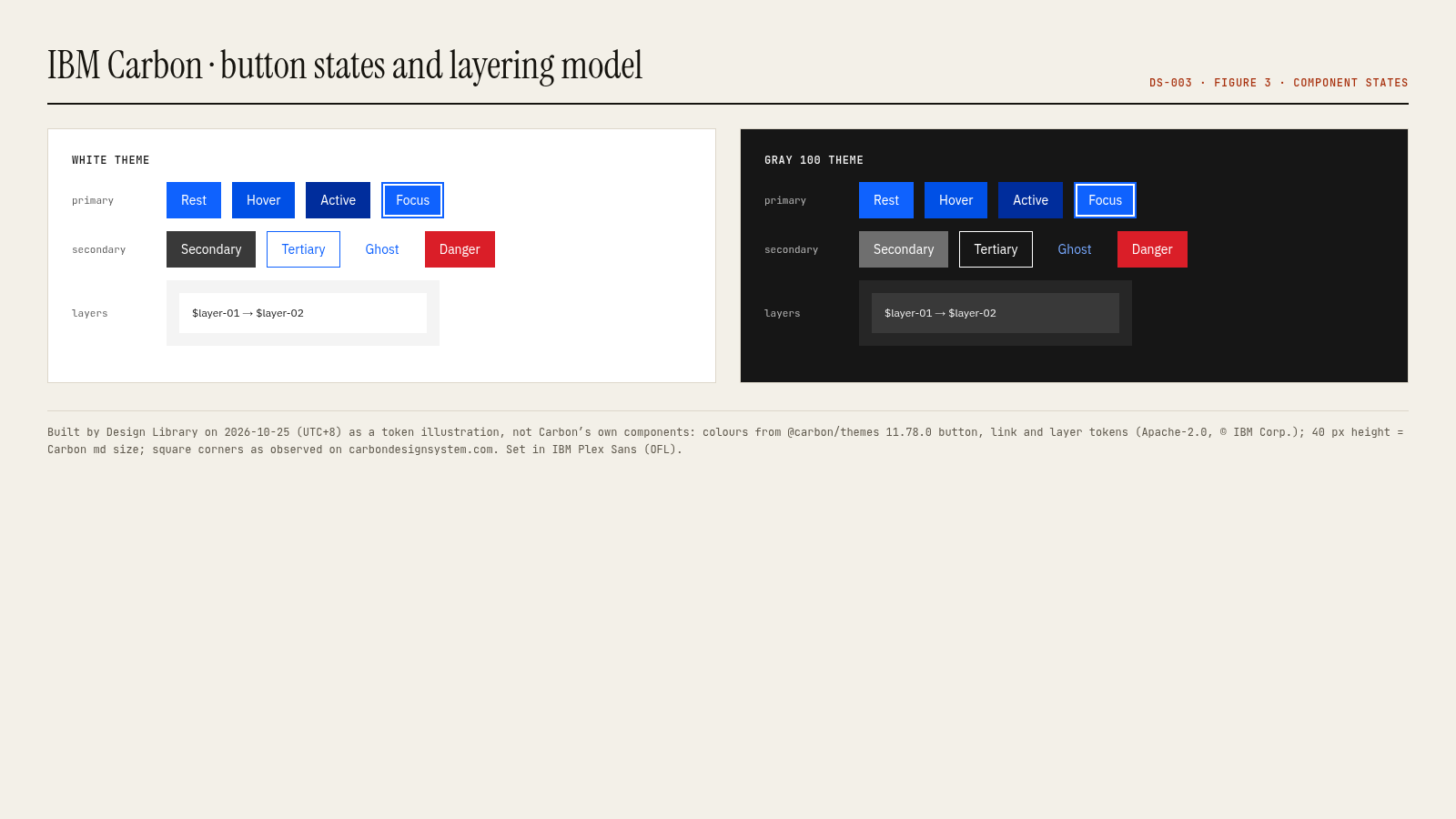
Rendered by Design Library on 2026-10-25 (UTC+8) from the official npm token packages (licence named in each caption); the button/card panels are our token illustrations, not the system’s own component code.
Related entries
Picked by us (OURS) for what you’ll want next after this entry, with the reason for each.
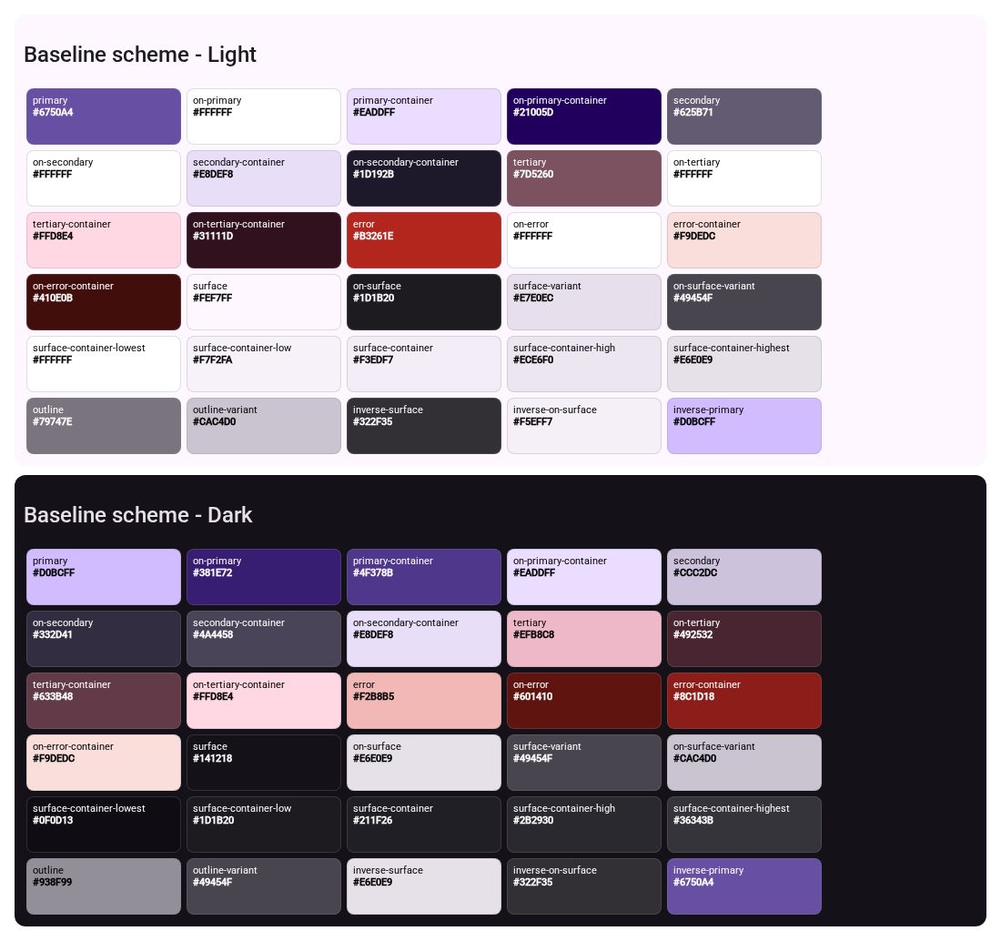
Material Design 3
Why: Material is the other big open token system; compare Carbon’s four fixed themes with Material’s generated tonal roles.
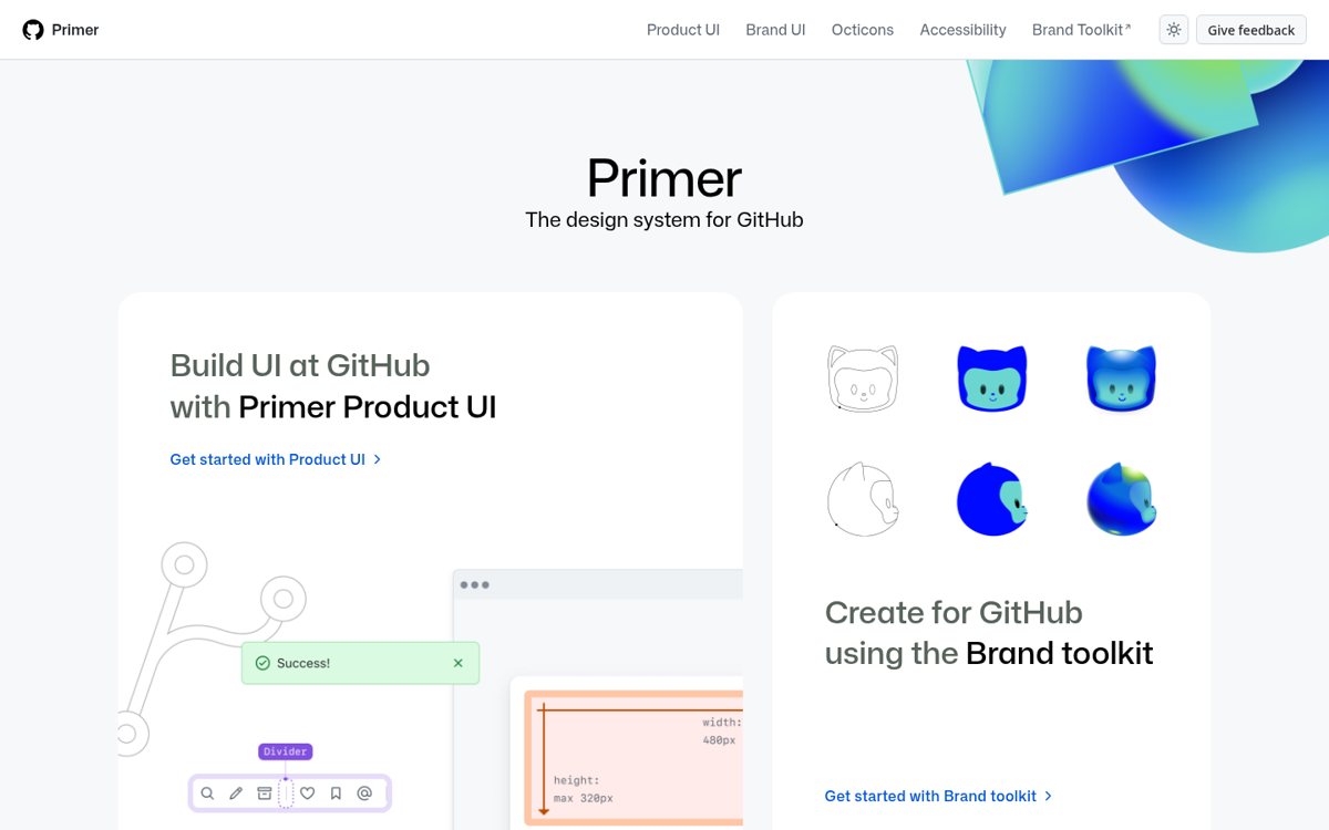
GitHub Primer
Why: Primer solves the same dense-product problem with functional tokens and nine themes.
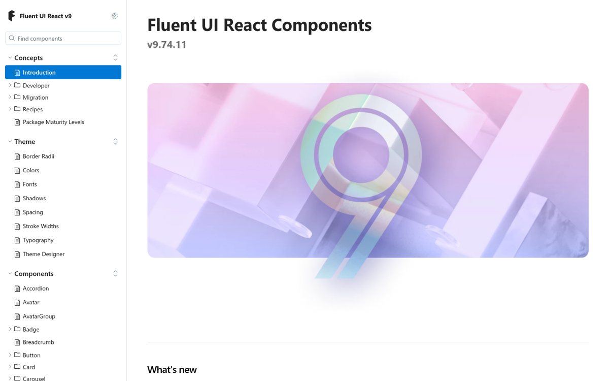
Microsoft Fluent 2
Why: Fluent is the other enterprise system; its soft shadows contrast with Carbon’s flat layering model.
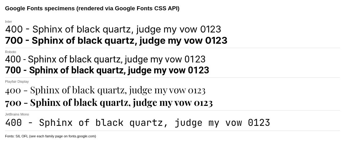
Google Fonts
Why: IBM Plex Sans and Mono are on Google Fonts, so you can prototype Carbon type anywhere.
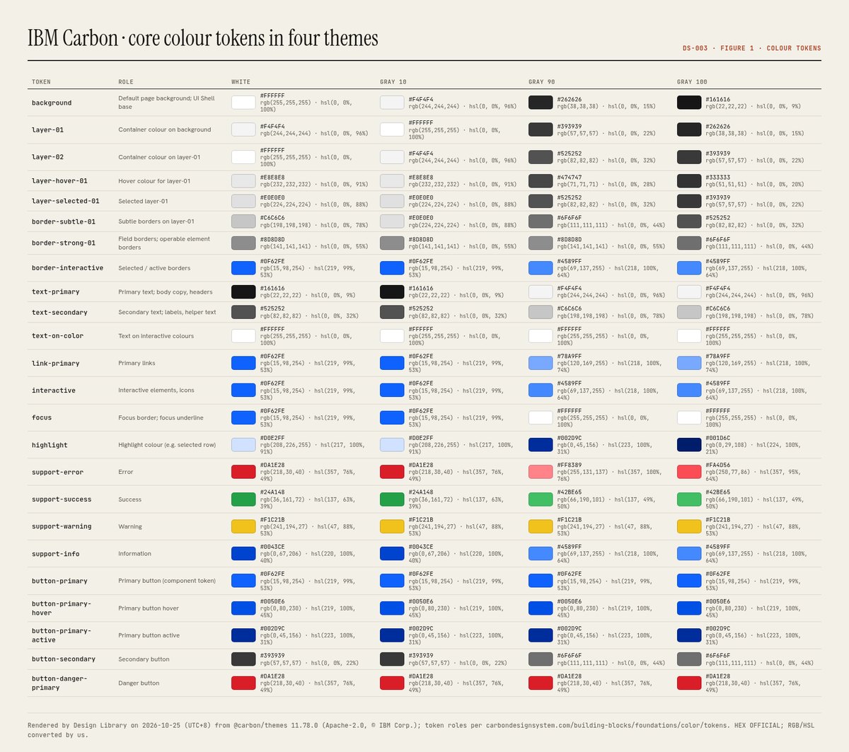
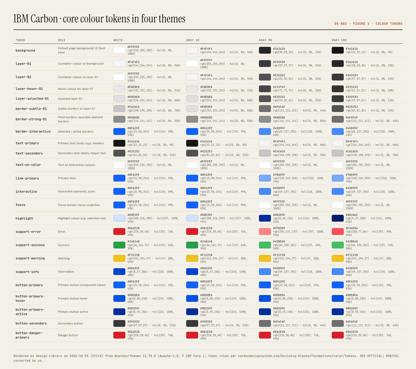
Core and button colour tokens across the four themes (White / Gray 10 / Gray 90 / Gray 100)
OFFICIAL values from @carbon/themes 11.78.0 (Apache-2.0), which carbondesignsystem.com/building-blocks/foundations/color/tokens documents (page last updated Sep 25, 2026). Tokens are role-based and identical across themes; only the value changes. In CSS they are custom properties prefixed --cds- (e.g. var(--cds-layer-01)).
Swatch order: White → Gray 10 → Gray 90 → Gray 100
White: #ffffffGray 10: #f4f4f4Gray 90: #262626Gray 100: #161616White: #f4f4f4Gray 10: #ffffffGray 90: #393939Gray 100: #262626White: #ffffffGray 10: #f4f4f4Gray 90: #525252Gray 100: #393939White: #e8e8e8Gray 10: #e8e8e8Gray 90: #474747Gray 100: #333333White: #e0e0e0Gray 10: #e0e0e0Gray 90: #525252Gray 100: #393939White: #c6c6c6Gray 10: #e0e0e0Gray 90: #6f6f6fGray 100: #525252White: #8d8d8dGray 10: #8d8d8dGray 90: #8d8d8dGray 100: #6f6f6fWhite: #0f62feGray 10: #0f62feGray 90: #4589ffGray 100: #4589ffWhite: #161616Gray 10: #161616Gray 90: #f4f4f4Gray 100: #f4f4f4White: #525252Gray 10: #525252Gray 90: #c6c6c6Gray 100: #c6c6c6White: #ffffffGray 10: #ffffffGray 90: #ffffffGray 100: #ffffffWhite: #0f62feGray 10: #0f62feGray 90: #78a9ffGray 100: #78a9ffWhite: #0f62feGray 10: #0f62feGray 90: #4589ffGray 100: #4589ffWhite: #0f62feGray 10: #0f62feGray 90: #ffffffGray 100: #ffffffWhite: #d0e2ffGray 10: #d0e2ffGray 90: #002d9cGray 100: #001d6cWhite: #da1e28Gray 10: #da1e28Gray 90: #ff8389Gray 100: #fa4d56White: #24a148Gray 10: #24a148Gray 90: #42be65Gray 100: #42be65White: #f1c21bGray 10: #f1c21bGray 90: #f1c21bGray 100: #f1c21bWhite: #0043ceGray 10: #0043ceGray 90: #4589ffGray 100: #4589ffWhite: #0f62feGray 10: #0f62feGray 90: #0f62feGray 100: #0f62feWhite: #0050e6Gray 10: #0050e6Gray 90: #0050e6Gray 100: #0050e6White: #002d9cGray 10: #002d9cGray 90: #002d9cGray 100: #002d9cWhite: #393939Gray 10: #393939Gray 90: #6f6f6fGray 100: #6f6f6fWhite: #da1e28Gray 10: #da1e28Gray 90: #da1e28Gray 100: #da1e28Dominant palette from our captures
Measured by us from our screenshot(s) of https://carbondesignsystem.com/ (median-cut quantization; share = % of pixels). Approximate and not official.
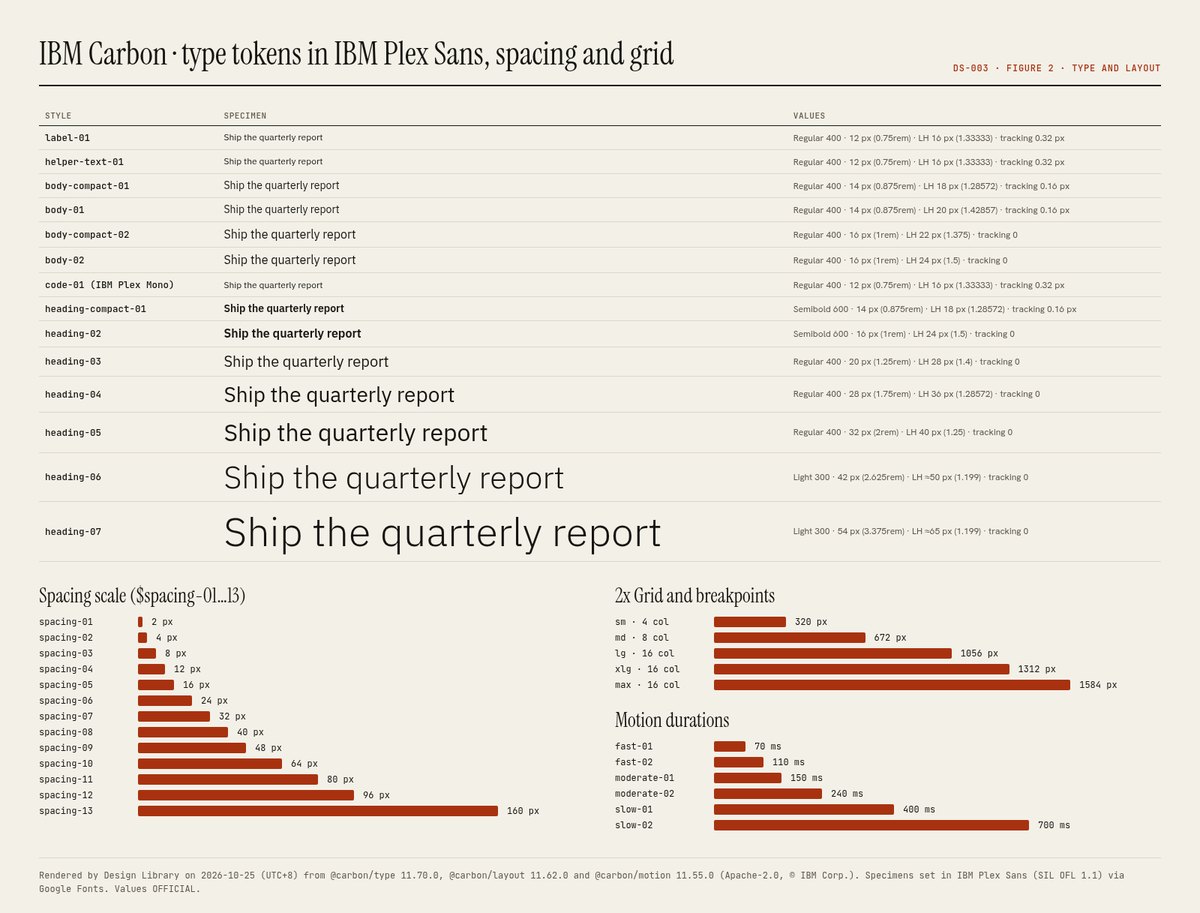
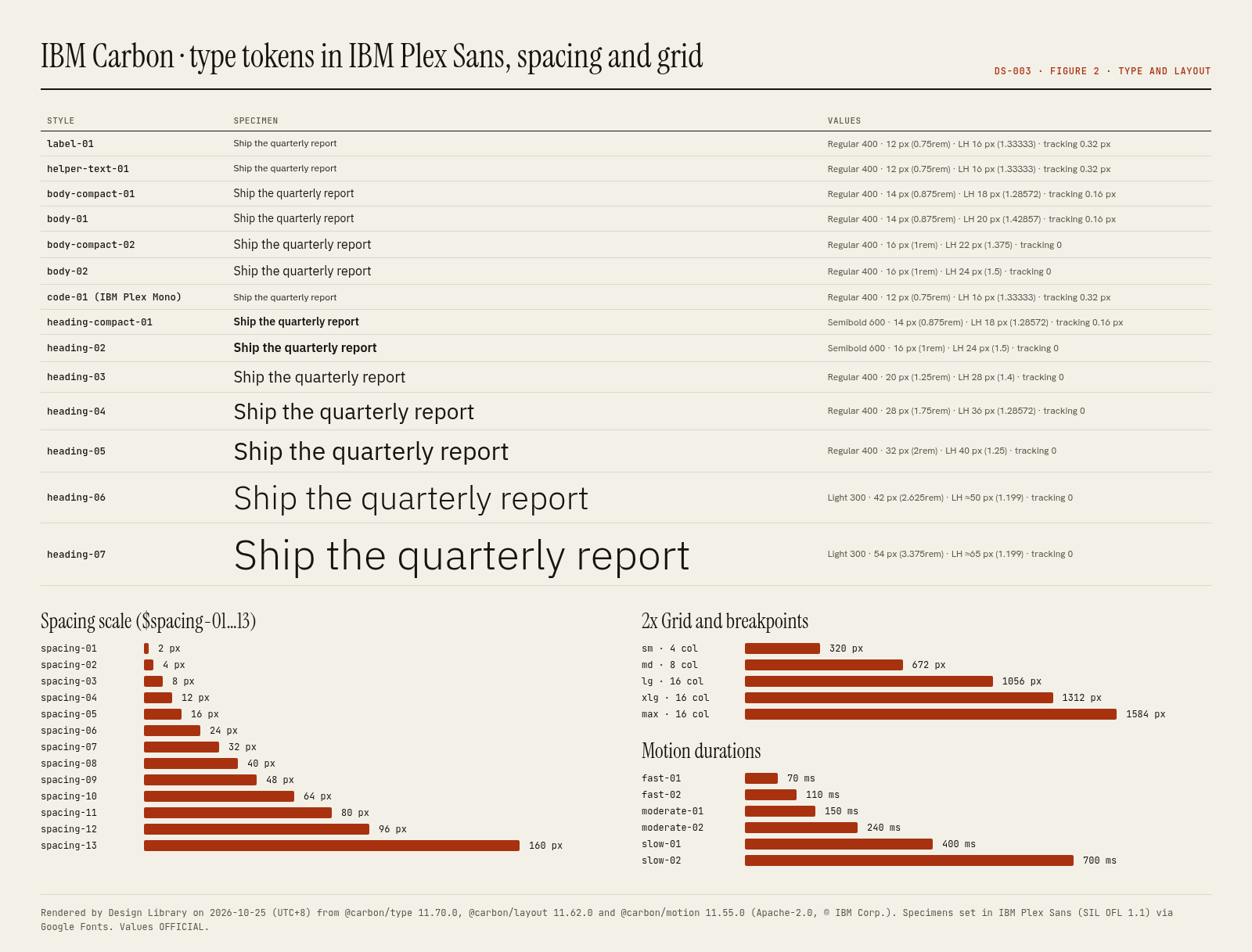
Carbon type tokens (IBM Plex Sans unless noted; @carbon/type 11.70.0; productive set suffix -01, expressive -02)
Specimens use this site’s body font (Hanken Grotesk) at the official size and weight, as a stand-in for the system’s own typeface.
Layout pattern: Documentation
Observed by us on the captured page(s). See all entries by layout.
How to apply it: Use a left nav tree, a readable center column and an on-page table of contents.
Other entries with this layout: Apple Human Interface Guidelines, Spotify brand & design guidelines, Vercel brand assets (Geist), DiceBear · Lorelei, DiceBear · Notionists (Notion-style avatars), Anthropic ‘frontend-design’ skill, NES.css, 98.css + XP.css, RPGUI, Pixel fonts: Press Start 2P, Pixelify Sans, Silkscreen, VT323, GitHub Primer, Microsoft Fluent 2, Flowbite (free, open-source).
Spacing, shape and other values
Gaps: Carbon does not publish a general elevation/shadow scale (it uses the layering model instead) or a radius token scale. ESTIMATED: components render with square (0 px) corners on our captures.
Components
Documented by the design system (from the research PDF).
- Buttons (primary, secondary, tertiary, ghost, danger; 7 sizes)
- UI Shell (header, side nav, panels)
- Data table
- Text input, text area, number input
- Dropdown, combo box, multiselect
- Checkbox, radio, toggle
- Date picker
- Modal
- Notifications (inline, toast, actionable)
- Tabs, content switcher
- Tile (clickable, selectable, expandable)
- Accordion
- Breadcrumb, pagination
- Progress indicator, loading, skeleton
- Tooltip, popover, toggletip
- Tag
- Tree view
- Slider
- File uploader
- AI label and AI presence (Carbon for AI)
Our analysis
Carbon is IBM’s answer to building hundreds of enterprise products that must look like one family. Its core idea is the layering model: four themes (White, Gray 10, Gray 90, Gray 100) assign values to role-based tokens such as $background, $layer-01 and $border-subtle-01, and each nested container steps to the next layer, alternating White/Gray 10 in light themes and getting one step lighter per layer in dark themes. That replaces shadows with tone, which keeps dense dashboards calm and flat. Type is split into a productive set (14 px base, fixed headings, for task UIs) and an expressive set (16 px base, fluid headings, for web pages), all in IBM Plex. Everything snaps to the 8-px 2x Grid. Blue 60 (#0f62fe) is the only action colour; status colours are used sparingly. Lessons: name tokens by role not by value, make one primary button per screen, use tone rather than elevation for hierarchy in dense UIs, and separate ‘productive’ from ‘expressive’ moments in both type and motion.
Similar to this
Ranked by shared category, type, industry sector and UX patterns first, then colour theme, layout and mood. Curated picks with reasons are on the Overview tab.
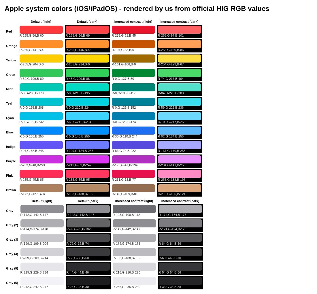
Downloads
PDF: research notes made for this library; third-party images inside follow the credits in their captions. License / terms of the source: Apache-2.0 (Carbon code, packages and website repo, © IBM Corp.); IBM Plex fonts SIL OFL 1.1; IBM and Carbon names/logos are IBM trademarks
DESIGN.md for AI coding agents
Copy this into your repo or agent context. OFFICIAL and ESTIMATED values are labelled.
# DESIGN.md · IBM Carbon Design System (DS-003)

> Written for AI coding agents. Values marked **OFFICIAL** come from the documented source named below; values marked **ESTIMATED** were measured by us from our own screenshots and are approximate. Never treat ESTIMATED values as official brand tokens.

## Overview
- Type: Design System · Category: C. Design Systems
- Platforms: Web, React, Web Components, Figma
- Color theme: Monochrome light · Layout pattern: Documentation · Mood: Precise, engineered, enterprise
- License / terms: Apache-2.0 (Carbon code, packages and website repo, © IBM Corp.); IBM Plex fonts SIL OFL 1.1; IBM and Carbon names/logos are IBM trademarks
- Industry: Platform design system
- Patterns: Docs sidebar, Docs with code tabs

IBM’s open-source design system for enterprise products: four themes driven by role-based colour tokens and a layering model, IBM Plex type sets (productive 14 px / expressive 16 px base), the 8-px 2x Grid, a 2–160 px spacing scale, productive/expressive motion and React + Web Components libraries.

### Analysis (ours)
Carbon is IBM’s answer to building hundreds of enterprise products that must look like one family. Its core idea is the layering model: four themes (White, Gray 10, Gray 90, Gray 100) assign values to role-based tokens such as $background, $layer-01 and $border-subtle-01, and each nested container steps to the next layer, alternating White/Gray 10 in light themes and getting one step lighter per layer in dark themes. That replaces shadows with tone, which keeps dense dashboards calm and flat. Type is split into a productive set (14 px base, fixed headings, for task UIs) and an expressive set (16 px base, fluid headings, for web pages), all in IBM Plex. Everything snaps to the 8-px 2x Grid. Blue 60 (#0f62fe) is the only action colour; status colours are used sparingly. Lessons: name tokens by role not by value, make one primary button per screen, use tone rather than elevation for hierarchy in dense UIs, and separate ‘productive’ from ‘expressive’ moments in both type and motion.

### Best practices (ours)
- Pick one of the four themes per surface and use inline theming (e.g. a Gray 100 UI Shell over a White page) instead of inventing a fifth.
- Nest containers with the layering tokens ($layer-01 → $layer-02) instead of adding shadows; that is how Carbon keeps dense pages flat and readable.
- Use the productive type set (14 px base, fixed headings) inside products and the expressive set (16 px base, fluid headings) on marketing pages.
- Show one primary button per screen; Carbon’s guidance says primary buttons should only appear once per screen.
- Snap every size to the 8-px mini unit of the 2x Grid and use spacing tokens (2–160 px), never ad-hoc pixel values.
- Use productive motion (fast-01 70 ms to moderate-02 240 ms, standard productive easing) for most interactions and save expressive motion for significant moments.
- Check contrast whenever you change $interactive or a layer token; the four themes ship pre-tested pairs.

### Deep analysis
Values marked OFFICIAL come from the cited official docs page or the official npm token package installed 2026-10-25 (UTC+8) (@carbon/themes 11.78.0, @carbon/type 11.70.0, @carbon/layout 11.62.0, @carbon/motion 11.55.0, @primer/primitives 11.10.0, @fluentui/react-theme 9.2.2). ESTIMATED values were computed or observed by us that day (WCAG 2 contrast ratios, what our captures show). OURS is our interpretation.

#### Purpose and audience (OFFICIAL) · source: https://carbondesignsystem.com/
- “Carbon is IBM’s enterprise-ready, open-source design system, shaped by the IBM Design Language” (carbondesignsystem.com home, 2026-10-25).
- Audience: designers and developers building IBM products and other dense enterprise software (data tables, consoles, dashboards); open to anyone under Apache-2.0.
- Delivery: React (@carbon/react) and Web Components (@carbon/web-components) libraries, Sass packages, Figma kits; the home page also promotes a Carbon MCP server and Carbon for AI guidance.

#### Colour model: themes, tokens, layering (OFFICIAL) · source: https://carbondesignsystem.com/building-blocks/foundations/color/overview
- Four default themes named after their background: White and Gray 10 (light), Gray 90 and Gray 100 (dark). @carbon/react defaults to White.
- Terms: a theme assigns values; a token is a role-based identifier that never changes across themes; a role cannot change between themes; a value is the hex/rgba.
- Layering model: in light themes layers alternate White / Gray 10 with each nested layer; in dark themes each layer is one step lighter.
- Core blue (#0f62fe, Blue 60) is the primary action colour across IBM products; “additional colors are used sparingly and purposefully”.
- Five interaction states per token (hover, active, selected…) are separate tokens, e.g. $background-hover.

#### Typography and grid (OFFICIAL) · source: https://carbondesignsystem.com/building-blocks/foundations/typography/type-sets
- IBM Plex Sans/Serif/Mono (OFL). Two type sets: productive (14 px base, fixed headings, for dense product pages) and expressive (16 px base, fluid headings that change at breakpoints, for web pages).
- Productive styles end in -01, expressive in -02; utility styles cover code, labels/helper text and legal copy.
- 2x Grid: “The basic unit … is the 8-pixel square mini unit”; values divide or multiply by two; 16 columns at lg (1056 px) and above.
- Spacing scale $spacing-01…13 = 2 to 160 px, complementing the grid and type scale with multiples of 2, 4 and 8.

#### Components and states (OFFICIAL) · source: https://carbondesignsystem.com/components/button/usage
- Button variants: primary, secondary, tertiary, ghost and danger; “Primary buttons should only appear once per screen”. Seven sizes from extra small to 2XL (component heights 24–80 px in @carbon/layout).
- Don’t use buttons for navigation; use links when the action takes the user to a new page.
- States are tokenised: $button-primary #0f62fe, hover #0050e6, active #002d9c; focus uses the $focus token (#0f62fe in White/Gray 10, #ffffff in Gray 90/100).
- Notifications, tags and support colours use $support-error #da1e28, $support-success #24a148, $support-warning #f1c21b, $support-info #0043ce (White theme).

#### Contrast checks we ran (ESTIMATED) · source: https://carbondesignsystem.com/building-blocks/foundations/color/tokens
- $text-primary on $background, White theme: 18.1:1; Gray 100: 16.45:1.
- $text-secondary on $background, White: 7.81:1; Gray 100: 10.59:1.
- $text-on-color on $button-primary: 5.0:1 (passes AA for normal text).
- $support-warning #f1c21b on White: 1.68:1, which is why Carbon pairs warning icons with dark glyphs rather than using the yellow for text.

#### Documentation site UX (OURS) · source: https://carbondesignsystem.com/
- Top navigation (Getting started, Building blocks, Building experiences, Support) over a left sidebar tree, with Usage / Style / Code / Accessibility tabs on component pages; the 2026 site groups Foundations, Components, Patterns and Data visualization under ‘Building blocks’ and redirects old /elements/ URLs.
- Pages state their ‘Last updated’ date at the top (e.g. Color tokens: Sep 25, 2026), which helps judge freshness.
- Token tables show every theme side by side with copy buttons; good model for our own token docs.

#### Lessons to take (OURS) · source: https://carbondesignsystem.com/
- Name tokens by role and keep the role fixed; only the values change between themes.
- In dense UIs, express hierarchy with tone (layers) instead of shadows.
- Split ‘productive’ and ‘expressive’ registers for type and motion rather than one compromise scale.
- Publish interaction states as tokens so hover/active colours don’t drift between teams.

### Usage terms at a glance (our summary, not legal advice)
- Commercial use: Yes. Apache-2.0 allows commercial use of Carbon code; IBM Plex is OFL 1.1 (free, including commercial)
- Attribution: Keep the Apache-2.0 licence and NOTICE with redistributed code; no UI credit required. Don’t use IBM logos or imply IBM endorsement
- Redistribution: Code yes under Apache-2.0; fonts yes under OFL (not sold on their own); IBM trademarks no
- How you get it: npm (@carbon/react, @carbon/web-components, @carbon/styles), Sass, Figma kits, GitHub

## Color tokens
OFFICIAL · Core and button colour tokens across the four themes (White / Gray 10 / Gray 90 / Gray 100). OFFICIAL values from @carbon/themes 11.78.0 (Apache-2.0), which carbondesignsystem.com/building-blocks/foundations/color/tokens documents (page last updated Sep 25, 2026). Tokens are role-based and identical across themes; only the value changes. In CSS they are custom properties prefixed --cds- (e.g. var(--cds-layer-01)).

| Role | White | Gray 10 | Gray 90 | Gray 100 |
|---|---|---|---|---|
| $background · Default page background; UI Shell base | `#ffffff` | `#f4f4f4` | `#262626` | `#161616` |
| $layer-01 · Container colour on background | `#f4f4f4` | `#ffffff` | `#393939` | `#262626` |
| $layer-02 · Container colour on layer-01 | `#ffffff` | `#f4f4f4` | `#525252` | `#393939` |
| $layer-hover-01 · Hover colour for layer-01 | `#e8e8e8` | `#e8e8e8` | `#474747` | `#333333` |
| $layer-selected-01 · Selected layer-01 | `#e0e0e0` | `#e0e0e0` | `#525252` | `#393939` |
| $border-subtle-01 · Subtle borders on layer-01 | `#c6c6c6` | `#e0e0e0` | `#6f6f6f` | `#525252` |
| $border-strong-01 · Field borders; operable element borders | `#8d8d8d` | `#8d8d8d` | `#8d8d8d` | `#6f6f6f` |
| $border-interactive · Selected / active borders | `#0f62fe` | `#0f62fe` | `#4589ff` | `#4589ff` |
| $text-primary · Primary text; body copy, headers | `#161616` | `#161616` | `#f4f4f4` | `#f4f4f4` |
| $text-secondary · Secondary text; labels, helper text | `#525252` | `#525252` | `#c6c6c6` | `#c6c6c6` |
| $text-on-color · Text on interactive colours | `#ffffff` | `#ffffff` | `#ffffff` | `#ffffff` |
| $link-primary · Primary links | `#0f62fe` | `#0f62fe` | `#78a9ff` | `#78a9ff` |
| $interactive · Interactive elements, icons | `#0f62fe` | `#0f62fe` | `#4589ff` | `#4589ff` |
| $focus · Focus border; focus underline | `#0f62fe` | `#0f62fe` | `#ffffff` | `#ffffff` |
| $highlight · Highlight colour (e.g. selected row) | `#d0e2ff` | `#d0e2ff` | `#002d9c` | `#001d6c` |
| $support-error · Error | `#da1e28` | `#da1e28` | `#ff8389` | `#fa4d56` |
| $support-success · Success | `#24a148` | `#24a148` | `#42be65` | `#42be65` |
| $support-warning · Warning | `#f1c21b` | `#f1c21b` | `#f1c21b` | `#f1c21b` |
| $support-info · Information | `#0043ce` | `#0043ce` | `#4589ff` | `#4589ff` |
| $button-primary · Primary button (component token) | `#0f62fe` | `#0f62fe` | `#0f62fe` | `#0f62fe` |
| $button-primary-hover · Primary button hover | `#0050e6` | `#0050e6` | `#0050e6` | `#0050e6` |
| $button-primary-active · Primary button active | `#002d9c` | `#002d9c` | `#002d9c` | `#002d9c` |
| $button-secondary · Secondary button | `#393939` | `#393939` | `#6f6f6f` | `#6f6f6f` |
| $button-danger-primary · Danger button | `#da1e28` | `#da1e28` | `#da1e28` | `#da1e28` |

ESTIMATED · dominant colors measured from our screenshot(s) of the source site (median-cut quantization; share = % of pixels). Approximate, not official:

- `#FFFFFF` ~50%
- `#BAE6FF` ~16%
- `#8595A6` ~5%

## Typography
OFFICIAL · Carbon type tokens (IBM Plex Sans unless noted; @carbon/type 11.70.0; productive set suffix -01, expressive -02)

| Token | Weight | Size | Line height | Tracking |
|---|---|---|---|---|
| label-01 | Regular | 12 px (0.75rem) | 16 px (1.33333) | 0.32 px |
| helper-text-01 | Regular | 12 px (0.75rem) | 16 px (1.33333) | 0.32 px |
| body-compact-01 | Regular | 14 px (0.875rem) | 18 px (1.28572) | 0.16 px |
| body-01 | Regular | 14 px (0.875rem) | 20 px (1.42857) | 0.16 px |
| body-compact-02 | Regular | 16 px (1rem) | 22 px (1.375) | 0 |
| body-02 | Regular | 16 px (1rem) | 24 px (1.5) | 0 |
| code-01 (IBM Plex Mono) | Regular | 12 px (0.75rem) | 16 px (1.33333) | 0.32 px |
| heading-compact-01 | Semibold | 14 px (0.875rem) | 18 px (1.28572) | 0.16 px |
| heading-02 | Semibold | 16 px (1rem) | 24 px (1.5) | 0 |
| heading-03 | Regular | 20 px (1.25rem) | 28 px (1.4) | 0 |
| heading-04 | Regular | 28 px (1.75rem) | 36 px (1.28572) | 0 |
| heading-05 | Regular | 32 px (2rem) | 40 px (1.25) | 0 |
| heading-06 | Light | 42 px (2.625rem) | ≈50 px (1.199) | 0 |
| heading-07 | Light | 54 px (3.375rem) | ≈65 px (1.199) | 0 |

## Spacing, radii, shadows
- OFFICIAL · Spacing scale ($spacing-01…13): 01: 2 · 02: 4 · 03: 8 · 04: 12 · 05: 16 · 06: 24 · 07: 32 · 08: 40 · 09: 48 · 10: 64 · 11: 80 · 12: 96 · 13: 160 px
- OFFICIAL · 2x Grid: 8-px mini unit; values divide or multiply by two; 16 columns from lg
- OFFICIAL · Breakpoints (@carbon/layout): sm 320 px / 4 col · md 672 / 8 · lg 1056 / 16 · xlg 1312 / 16 · max 1584 / 16; margins 0 / 16 / 16 / 16 / 24 px
- OFFICIAL · Component heights (@carbon/layout sizes): xs 24 · sm 32 · md 40 · lg 48 · xl 64 · 2xl 80 px; buttons come in seven sizes
- OFFICIAL · Motion durations: fast-01 70 · fast-02 110 · moderate-01 150 · moderate-02 240 · slow-01 400 · slow-02 700 ms
- OFFICIAL · Easing (productive / expressive): standard (0.2,0,0.38,0.9) / (0.4,0.14,0.3,1) · entrance (0,0,0.38,0.9) / (0,0,0.3,1) · exit (0.2,0,1,0.9) / (0.4,0.14,1,1)
- OFFICIAL · Interaction overlays: $background-hover rgba(141,141,141,0.12) · $background-active rgba(141,141,141,0.5) · $background-selected rgba(141,141,141,0.2) (White theme)
- OFFICIAL · Type families: IBM Plex Sans, IBM Plex Serif, IBM Plex Mono (SIL OFL 1.1); base 14 px productive, 16 px expressive
- Gaps (not documented / not verified): Carbon does not publish a general elevation/shadow scale (it uses the layering model instead) or a radius token scale. ESTIMATED: components render with square (0 px) corners on our captures.

## Components
- Buttons (primary, secondary, tertiary, ghost, danger; 7 sizes)
- UI Shell (header, side nav, panels)
- Data table
- Text input, text area, number input
- Dropdown, combo box, multiselect
- Checkbox, radio, toggle
- Date picker
- Modal
- Notifications (inline, toast, actionable)
- Tabs, content switcher
- Tile (clickable, selectable, expandable)
- Accordion
- Breadcrumb, pagination
- Progress indicator, loading, skeleton
- Tooltip, popover, toggletip
- Tag
- Tree view
- Slider
- File uploader
- AI label and AI presence (Carbon for AI)

## Layout rules
- Observed layout pattern: **Documentation** (from our captures).

## Usage
```
npm install @carbon/react   # or @carbon/web-components
// styles.scss
@use '@carbon/react';               // White theme by default
@use '@carbon/react/scss/themes';
@use '@carbon/react/scss/theme' with ($theme: themes.$g100);
// tokens in CSS: var(--cds-background), var(--cds-layer-01), var(--cds-interactive)
```

## Do’s and don’ts
- Do: Keep chrome neutral and let content (images, icons, type) carry color.
- Don’t: Don’t introduce decorative color that competes with content.
- Do: follow the source’s license/terms listed above.
- Don’t: present ESTIMATED colors as official tokens.

## Related entries (ours)
- DS-001: Material is the other big open token system; compare Carbon’s four fixed themes with Material’s generated tonal roles. · https://design-library-byt.pages.dev/entry/DS-001
- DS-004: Primer solves the same dense-product problem with functional tokens and nine themes. · https://design-library-byt.pages.dev/entry/DS-004
- DS-005: Fluent is the other enterprise system; its soft shadows contrast with Carbon’s flat layering model. · https://design-library-byt.pages.dev/entry/DS-005
- FT-001: IBM Plex Sans and Mono are on Google Fonts, so you can prototype Carbon type anywhere. · https://design-library-byt.pages.dev/entry/FT-001

## Sources
- https://carbondesignsystem.com/
- Library entry: https://design-library-byt.pages.dev/entry/DS-003