Phosphor Icons
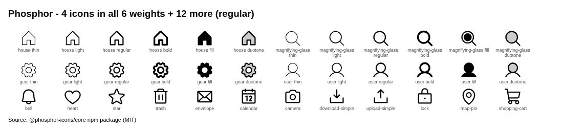
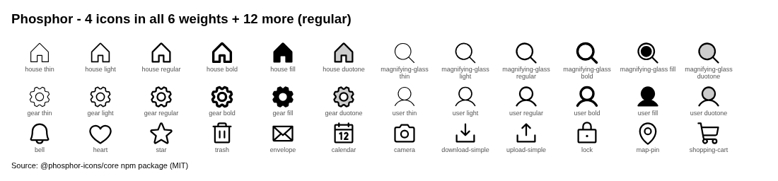
Flexible icon family: Thin, Light, Regular, Bold, Fill, Duotone.
Summary
Flexible icon family: Thin, Light, Regular, Bold, Fill, Duotone.
What it is
An open-source icon set with consistent grid, stroke and naming, distributed as SVG and framework packages.
Who it’s for
Designers and developers who need a coherent, license-clear icon set for UI.
Key takeaways
- Captured phosphoricons.com: warm off-white canvas, lime-yellow banner and scattered paper-clip objects; the headline and feature list sit left of a wide icon specimen.
- One of the few icon sites with a distinct warm, editorial personality.
- Color: warm neutral theme; dominant colors #EEEAE3, #ABA193, #BDDA58 (ESTIMATED from our capture).
Best practices to borrow
- Use off-white or cream surfaces with warm grays and sparse accents.
- Put the promise on one side and proof (product, media or illustration) on the other; keep the headline short.
- Pick one set, one size and one stroke weight per product; don’t mix sets in the same UI.
Palette preview
Quick links
Figures
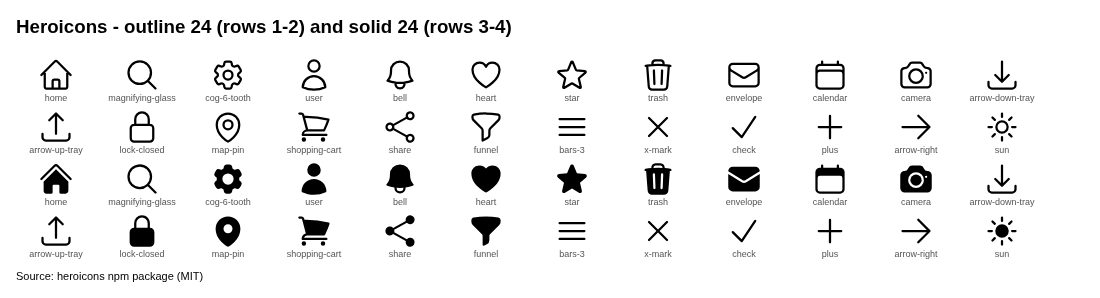
Extracted from the v2 research PDF. Only figures the research team rendered from open-licensed or official public values are shown; official page screenshots and third-party artwork are not published here (they are blanked in the downloadable PDF). Captions and credits are as written in the PDF.

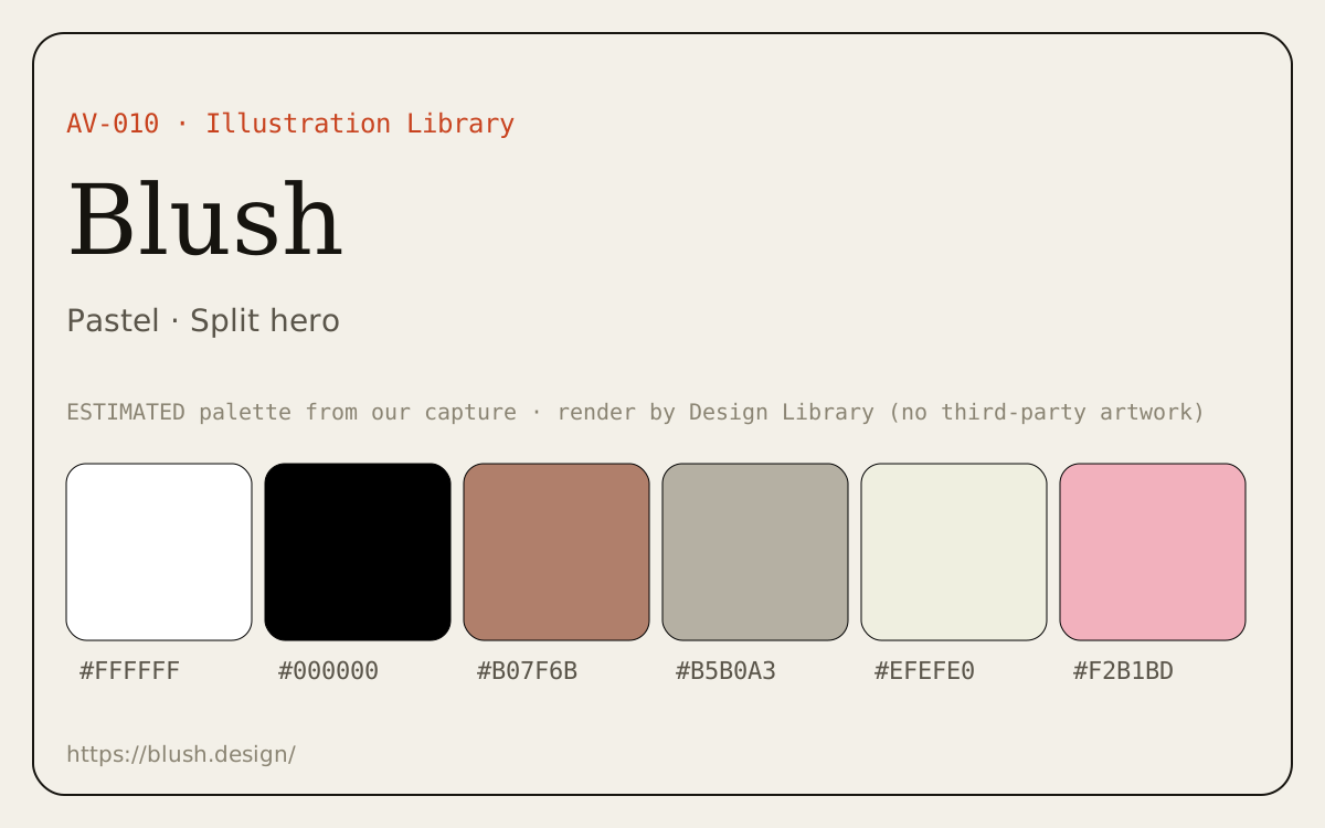
Dominant palette from our captures
Measured by us from our screenshot(s) of https://phosphoricons.com (median-cut quantization; share = % of pixels). Approximate and not official.
Layout pattern: Split hero
Observed by us on the captured page(s). See all entries by layout.
How to apply it: Put the promise on one side and proof (product, media or illustration) on the other; keep the headline short.
Other entries with this layout: Material Design 3, Heroicons, Linear, Stripe, Notion, DiceBear, Open Peeps, Humaaans, Blush, Linear onboarding flow.
Our analysis
Captured phosphoricons.com: warm off-white canvas, lime-yellow banner and scattered paper-clip objects; the headline and feature list sit left of a wide icon specimen. One of the few icon sites with a distinct warm, editorial personality.
Similar to this
Ranked by shared color theme, layout, category, type and mood tags.
Downloads
PDF: research notes made for this library; third-party images inside follow the credits in their captions. License / terms of the source: MIT
DESIGN.md for AI coding agents
Copy this into your repo or agent context. OFFICIAL and ESTIMATED values are labelled.
# DESIGN.md · Phosphor Icons (IC-003)

> Written for AI coding agents. Values marked **OFFICIAL** come from the documented source named below; values marked **ESTIMATED** were measured by us from our own screenshots and are approximate. Never treat ESTIMATED values as official brand tokens.

## Overview
- Type: Icon Library · Category: D. Icons and Visual Assets
- Platforms: Web, React, Vue, Flutter, Swift
- Color theme: Warm neutral · Layout pattern: Split hero · Mood: Playful, crafted, warm
- License / terms: MIT

Flexible icon family: Thin, Light, Regular, Bold, Fill, Duotone.

### Analysis (ours)
Captured phosphoricons.com: warm off-white canvas, lime-yellow banner and scattered paper-clip objects; the headline and feature list sit left of a wide icon specimen. One of the few icon sites with a distinct warm, editorial personality.

## Color tokens
No official color tokens documented for this entry.

ESTIMATED · dominant colors measured from our screenshot(s) of the source site (median-cut quantization; share = % of pixels). Approximate, not official:

- `#EEEAE3` ~62%
- `#ABA193` ~9%
- `#BDDA58` ~7%
- `#3E3D3A` ~7%
- `#827C71` ~2%
- `#D4DCA6` ~2%

## Typography
No official type scale documented for this entry; use the product’s own typography guidance.

## Spacing, radii, shadows
Not documented for this entry. Do not invent values; derive from your own design system.

## Components
No component inventory documented for this entry.

## Layout rules
- Observed layout pattern: **Split hero** (from our captures).

## Do’s and don’ts
- Do: Use off-white/cream surfaces and warm grays; keep accents sparse.
- Don’t: Don’t switch to cold pure-white/blue-gray surfaces.
- Do: follow the source’s license/terms listed above.
- Don’t: present ESTIMATED colors as official tokens.

## Sources
- https://phosphoricons.com
- Library entry: https://design-library-byt.pages.dev/entry/IC-003