Blush
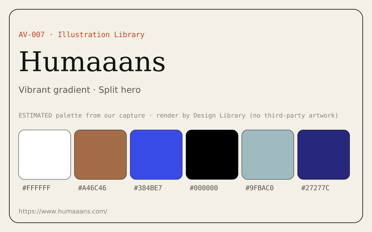
Illustration builder with collections from many artists (including Open Peeps and Humaaans); customize and export. Link-only here.
Summary
Illustration builder with collections from many artists (including Open Peeps and Humaaans); customize and export. Link-only here.
What it is
A library of illustrations for product UI and marketing.
Who it’s for
Designers who need empty-state, onboarding or marketing illustrations with a clear license.
Key takeaways
- Captured blush.design: split hero with a large colorful character illustration and a short headline on white.
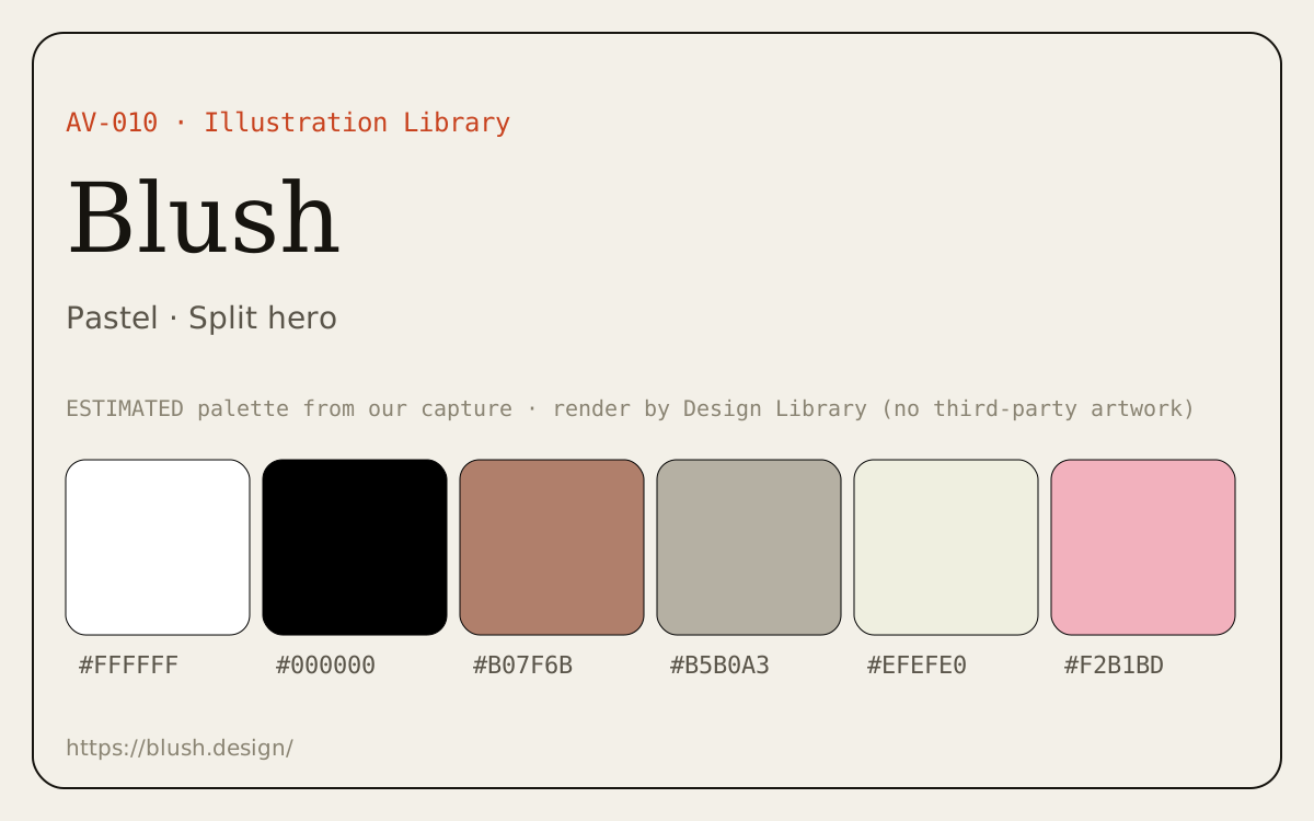
- Color: pastel theme; dominant colors #FFFFFF, #000000, #B07F6B (ESTIMATED from our capture).
- Layout: split hero pattern, playful, illustrative mood.
Best practices to borrow
- Use soft tonal surfaces with one stronger accent for actions.
- Put the promise on one side and proof (product, media or illustration) on the other; keep the headline short.
- Keep one illustration style across the product and recolor it to your palette where allowed.
Palette preview
How to use
Customize on blush.design, export SVG/PNG (some features are Pro).Link-only entry: no third-party images are reproduced; the hero above is our own palette render. Open the source for visuals.
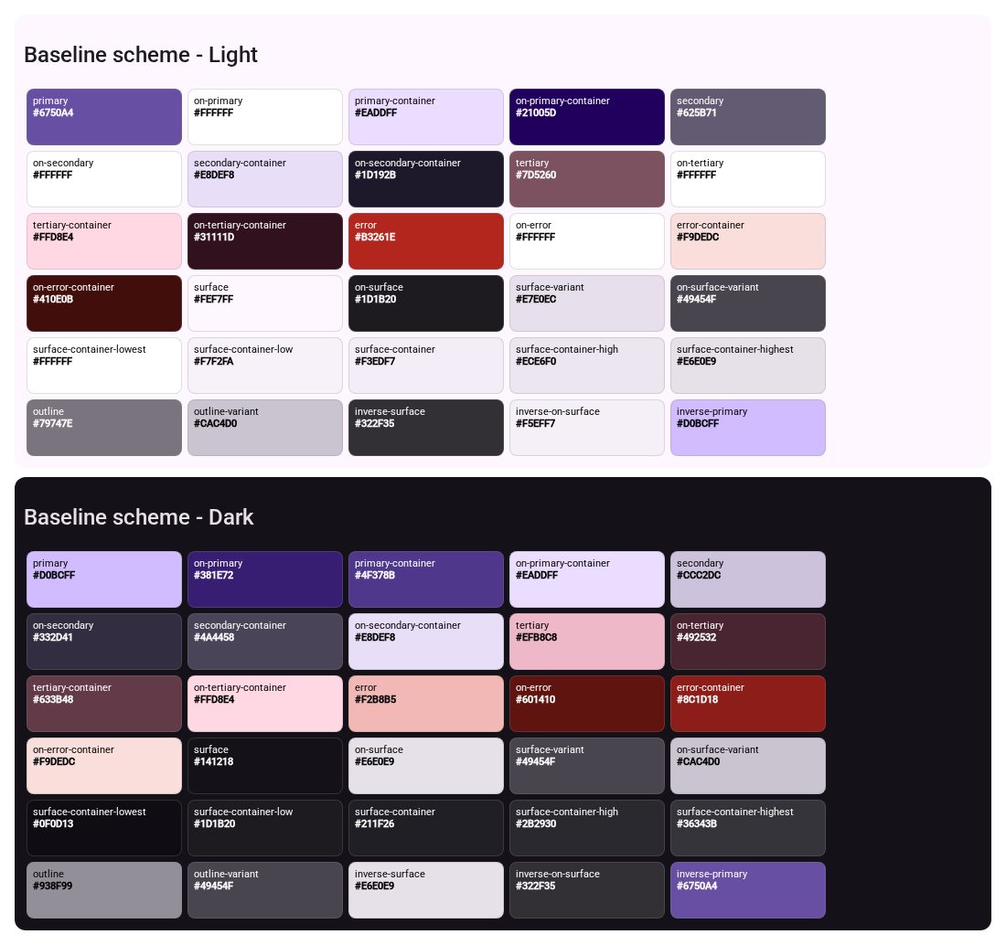
Dominant palette from our captures
Measured by us from our screenshot(s) of https://blush.design/ (median-cut quantization; share = % of pixels). Approximate and not official.
Layout pattern: Split hero
Observed by us on the captured page(s). See all entries by layout.
How to apply it: Put the promise on one side and proof (product, media or illustration) on the other; keep the headline short.
Other entries with this layout: Material Design 3, Heroicons, Phosphor Icons, Linear, Stripe, Notion, DiceBear, Open Peeps, Humaaans, Linear onboarding flow.
Our analysis
Captured blush.design: split hero with a large colorful character illustration and a short headline on white.
Similar to this
Ranked by shared color theme, layout, category, type and mood tags.
Downloads
License / terms of the source: Blush license: free for commercial and non-commercial use; no resale/redistribution, no merchandising, no competing service; artists keep ownership; credit appreciated, not required
DESIGN.md for AI coding agents
Copy this into your repo or agent context. OFFICIAL and ESTIMATED values are labelled.
# DESIGN.md · Blush (AV-010)

> Written for AI coding agents. Values marked **OFFICIAL** come from the documented source named below; values marked **ESTIMATED** were measured by us from our own screenshots and are approximate. Never treat ESTIMATED values as official brand tokens.

## Overview
- Type: Illustration Library · Category: J. Avatars and Illustrations
- Platforms: Web
- Color theme: Pastel · Layout pattern: Split hero · Mood: Playful, illustrative
- License / terms: Blush license: free for commercial and non-commercial use; no resale/redistribution, no merchandising, no competing service; artists keep ownership; credit appreciated, not required

Illustration builder with collections from many artists (including Open Peeps and Humaaans); customize and export. Link-only here.

### Analysis (ours)
Captured blush.design: split hero with a large colorful character illustration and a short headline on white.

## Color tokens
No official color tokens documented for this entry.

ESTIMATED · dominant colors measured from our screenshot(s) of the source site (median-cut quantization; share = % of pixels). Approximate, not official:

- `#FFFFFF` ~77%
- `#000000` ~5%
- `#B07F6B` ~4%
- `#B5B0A3` ~3%
- `#EFEFE0` ~2%
- `#F2B1BD` ~2%

## Typography
No official type scale documented for this entry; use the product’s own typography guidance.

## Spacing, radii, shadows
Not documented for this entry. Do not invent values; derive from your own design system.

## Components
No component inventory documented for this entry.

## Layout rules
- Observed layout pattern: **Split hero** (from our captures).

## Usage
```
Customize on blush.design, export SVG/PNG (some features are Pro).
```

## Do’s and don’ts
- Do: Use soft tonal surfaces with one stronger accent for actions.
- Don’t: Don’t rely on pastel-on-pastel for text; check contrast.
- Do: follow the source’s license/terms listed above.
- Don’t: present ESTIMATED colors as official tokens.

## Sources
- https://blush.design/
- Library entry: https://design-library-byt.pages.dev/entry/AV-010