Material Design 3
Google design system; baseline color roles (light/dark HEX/RGB/HSL), type scale, shape, elevation, state opacities, components, UX lessons. Gaps: breakpoints, motion, shadow CSS.
Summary
Google design system; baseline color roles (light/dark HEX/RGB/HSL), type scale, shape, elevation, state opacities, components, UX lessons. Gaps: breakpoints, motion, shadow CSS.
What it is
An official design system: documented foundations (color, type, layout) plus components and usage guidance.
Who it’s for
Product designers and front-end engineers building apps that should feel native to the platform, or teams studying a mature system before writing their own.
Key takeaways
- Captured m3.material.io landing: split hero with a large rounded-corner title card on a pale lilac surface next to a tall media card; navigation rail on the left.
- The documented token set is tone-based (primary #6750A4 light / #D0BCFF dark), so the whole site reads as soft lilac tones rather than a single brand color.
- Strength: one seed color themes everything; risk: low-chroma surfaces can feel washed out without a strong accent.
Best practices to borrow
- Use soft tonal surfaces with one stronger accent for actions.
- Put the promise on one side and proof (product, media or illustration) on the other; keep the headline short.
- Adopt its tokens through variables, not hard-coded values, and follow its component guidance before customizing.
Palette preview
Quick links
Figures
Extracted from the v2 research PDF. Only figures the research team rendered from open-licensed or official public values are shown; official page screenshots and third-party artwork are not published here (they are blanked in the downloadable PDF). Captions and credits are as written in the PDF.

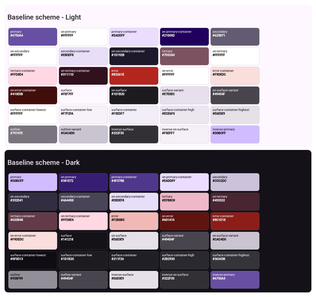
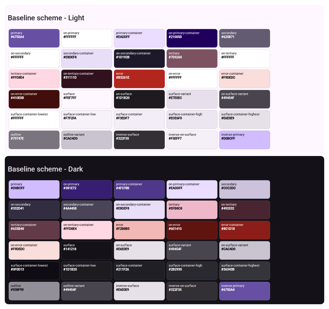
Baseline color roles (light / dark)
Extracted from the Material-3-Design-System.pdf research PDF (values marked OFFICIAL there; from Google's material-web token files v0.192, Apache-2.0). px conversions at 16px root.
Swatch order: Light → Dark
Light: #6750A4Dark: #D0BCFFLight: #FFFFFFDark: #381E72Light: #EADDFFDark: #4F378BLight: #21005DDark: #EADDFFLight: #625B71Dark: #CCC2DCLight: #E8DEF8Dark: #4A4458Light: #7D5260Dark: #EFB8C8Light: #FFD8E4Dark: #633B48Light: #B3261EDark: #F2B8B5Light: #F9DEDCDark: #8C1D18Light: #FEF7FFDark: #141218Light: #1D1B20Dark: #E6E0E9Light: #E7E0ECDark: #49454FLight: #49454FDark: #CAC4D0Light: #F3EDF7Dark: #211F26Light: #ECE6F0Dark: #2B2930Light: #79747EDark: #938F99Light: #CAC4D0Dark: #49454FLight: #322F35Dark: #E6E0E9Light: #D0BCFFDark: #6750A4Dominant palette from our captures
Measured by us from our screenshot(s) of https://m3.material.io (median-cut quantization; share = % of pixels). Approximate and not official.
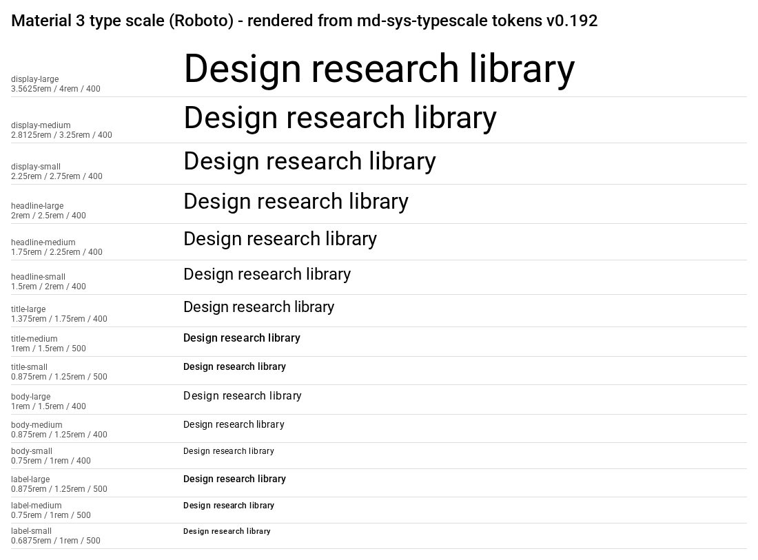
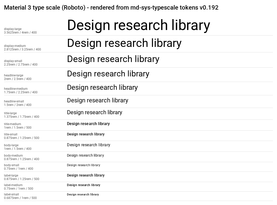
Type scale (brand/plain typeface: Roboto)
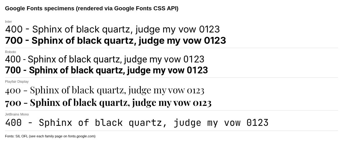
Specimens use this site’s body font (Hanken Grotesk) at the official size and weight, as a stand-in for the system’s own typeface.
Layout pattern: Split hero
Observed by us on the captured page(s). See all entries by layout.
How to apply it: Put the promise on one side and proof (product, media or illustration) on the other; keep the headline short.
Other entries with this layout: Heroicons, Phosphor Icons, Linear, Stripe, Notion, DiceBear, Open Peeps, Humaaans, Blush, Linear onboarding flow.
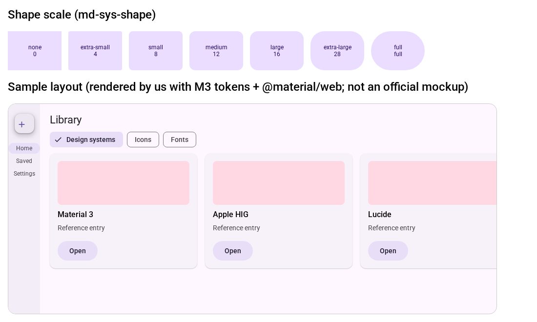
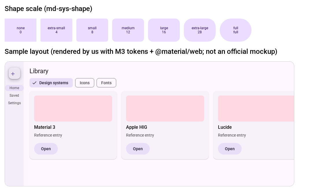
Spacing, shape and other values
Gaps: Not verified in the PDF: breakpoints, margins, motion tokens, shadow CSS, numeric font weights.
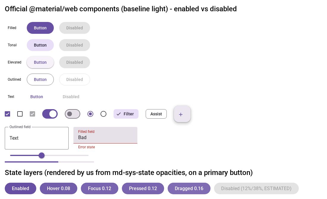
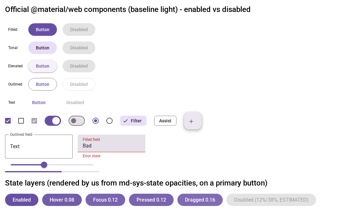
Components
Documented by the design system (from the research PDF).
- Buttons (elevated, filled, tonal, outlined, text)
- FAB
- Chips
- Navigation rail / bar / drawer
- Cards
- Dialogs
- Text fields
- Switches, checkboxes, radios
- Sliders
- Progress indicators
Our analysis
Captured m3.material.io landing: split hero with a large rounded-corner title card on a pale lilac surface next to a tall media card; navigation rail on the left. The documented token set is tone-based (primary #6750A4 light / #D0BCFF dark), so the whole site reads as soft lilac tones rather than a single brand color. Strength: one seed color themes everything; risk: low-chroma surfaces can feel washed out without a strong accent.
Similar to this
Ranked by shared color theme, layout, category, type and mood tags.
Downloads
PDF: research notes made for this library; third-party images inside follow the credits in their captions. License / terms of the source: Apache-2.0 (tokens/components/Material Symbols)
DESIGN.md for AI coding agents
Copy this into your repo or agent context. OFFICIAL and ESTIMATED values are labelled.
# DESIGN.md · Material Design 3 (DS-001)

> Written for AI coding agents. Values marked **OFFICIAL** come from the documented source named below; values marked **ESTIMATED** were measured by us from our own screenshots and are approximate. Never treat ESTIMATED values as official brand tokens.

## Overview
- Type: Design System · Category: C. Design Systems
- Platforms: Android, Web, Flutter, Cross-platform
- Color theme: Pastel · Layout pattern: Split hero · Mood: Expressive, tonal, rounded
- License / terms: Apache-2.0 (tokens/components/Material Symbols)

Google design system; baseline color roles (light/dark HEX/RGB/HSL), type scale, shape, elevation, state opacities, components, UX lessons. Gaps: breakpoints, motion, shadow CSS.

### Analysis (ours)
Captured m3.material.io landing: split hero with a large rounded-corner title card on a pale lilac surface next to a tall media card; navigation rail on the left. The documented token set is tone-based (primary #6750A4 light / #D0BCFF dark), so the whole site reads as soft lilac tones rather than a single brand color. Strength: one seed color themes everything; risk: low-chroma surfaces can feel washed out without a strong accent.

## Color tokens
OFFICIAL · Baseline color roles (light / dark). Extracted from the Material-3-Design-System.pdf research PDF (values marked OFFICIAL there; from Google's material-web token files v0.192, Apache-2.0). px conversions at 16px root.

| Role | Light | Dark |
|---|---|---|
| primary | `#6750A4` | `#D0BCFF` |
| on-primary | `#FFFFFF` | `#381E72` |
| primary-container | `#EADDFF` | `#4F378B` |
| on-primary-container | `#21005D` | `#EADDFF` |
| secondary | `#625B71` | `#CCC2DC` |
| secondary-container | `#E8DEF8` | `#4A4458` |
| tertiary | `#7D5260` | `#EFB8C8` |
| tertiary-container | `#FFD8E4` | `#633B48` |
| error | `#B3261E` | `#F2B8B5` |
| error-container | `#F9DEDC` | `#8C1D18` |
| background / surface | `#FEF7FF` | `#141218` |
| on-surface | `#1D1B20` | `#E6E0E9` |
| surface-variant | `#E7E0EC` | `#49454F` |
| on-surface-variant | `#49454F` | `#CAC4D0` |
| surface-container | `#F3EDF7` | `#211F26` |
| surface-container-high | `#ECE6F0` | `#2B2930` |
| outline | `#79747E` | `#938F99` |
| outline-variant | `#CAC4D0` | `#49454F` |
| inverse-surface | `#322F35` | `#E6E0E9` |
| inverse-primary | `#D0BCFF` | `#6750A4` |

ESTIMATED · dominant colors measured from our screenshot(s) of the source site (median-cut quantization; share = % of pixels). Approximate, not official:

- `#F8F1F6` ~34%
- `#494775` ~19%
- `#DCD5EB` ~13%
- `#F3FC9A` ~1%

## Typography
OFFICIAL · Type scale (brand/plain typeface: Roboto)

| Style | Size | Line height | Tracking | Weight token |
|---|---|---|---|---|
| display-large | 57px / 3.5625rem | 64px | -0.015625rem | regular |
| display-medium | 45px | 52px | 0 | regular |
| display-small | 36px | 44px | 0 | regular |
| headline-large | 32px | 40px | 0 | regular |
| headline-medium | 28px | 36px | 0 | regular |
| headline-small | 24px | 32px | 0 | regular |
| title-large | 22px | 28px | 0 | regular |
| title-medium | 16px | 24px | 0.009375rem | medium |
| title-small | 14px | 20px | 0.00625rem | medium |
| body-large | 16px | 24px | 0.03125rem | regular |
| body-medium | 14px | 20px | 0.015625rem | regular |
| body-small | 12px | 16px | 0.025rem | regular |
| label-large | 14px | 20px | 0.00625rem | medium |
| label-medium | 12px | 16px | 0.03125rem | medium |
| label-small | 11px | 16px | 0.03125rem | medium |

## Spacing, radii, shadows
- OFFICIAL · Shape (corner radii): none 0 · extra-small 4px · small 8px · medium 12px · large 16px · extra-large 28px · full 9999px
- OFFICIAL · Elevation levels (dp): level0 0 · level1 1 · level2 3 · level3 6 · level4 8 · level5 12
- OFFICIAL · State-layer opacities: hover 0.08 · focus 0.12 · pressed 0.12 · dragged 0.16
- Gaps (not documented / not verified): Not verified in the PDF: breakpoints, margins, motion tokens, shadow CSS, numeric font weights.

## Components
- Buttons (elevated, filled, tonal, outlined, text)
- FAB
- Chips
- Navigation rail / bar / drawer
- Cards
- Dialogs
- Text fields
- Switches, checkboxes, radios
- Sliders
- Progress indicators

## Layout rules
- Observed layout pattern: **Split hero** (from our captures).

## Do’s and don’ts
- Do: Use soft tonal surfaces with one stronger accent for actions.
- Don’t: Don’t rely on pastel-on-pastel for text; check contrast.
- Do: follow the source’s license/terms listed above.
- Don’t: present ESTIMATED colors as official tokens.

## Sources
- https://m3.material.io
- Library entry: https://design-library-byt.pages.dev/entry/DS-001