Boring Avatars
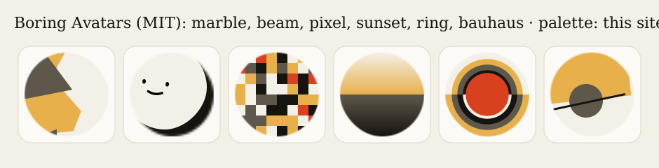
Open-source React component that generates abstract SVG avatars (marble, beam, pixel, sunset, ring, bauhaus) from a name and a palette you provide.
Summary
Open-source React component that generates abstract SVG avatars (marble, beam, pixel, sunset, ring, bauhaus) from a name and a palette you provide.
What it is
An avatar generator or set you can use in product UIs.
Who it’s for
Teams that need placeholder or user avatars with clear licensing.
Key takeaways
- Captured boringavatars.com: a dashboard-like grid of generated avatars and palette controls on soft teal/gray surfaces.
- Color: pastel theme; dominant colors #FFFFFF, #C1D8D9, #919C9D (ESTIMATED from our capture).
- Layout: card grid pattern, playful, geometric mood.
Best practices to borrow
- Use soft tonal surfaces with one stronger accent for actions.
- Use a uniform card grid with consistent thumbnails and minimal text per card; put filters above.
- Seed avatars deterministically from a user ID so each person always gets the same one.
Palette preview
Quick links
How to use
npm i boring-avatars
import Avatar from 'boring-avatars';
<Avatar name="Maria Mitchell" variant="beam" colors={['#16140F','#D9411E','#F3F0E8','#E8B04B','#5E584C']} />
Figures
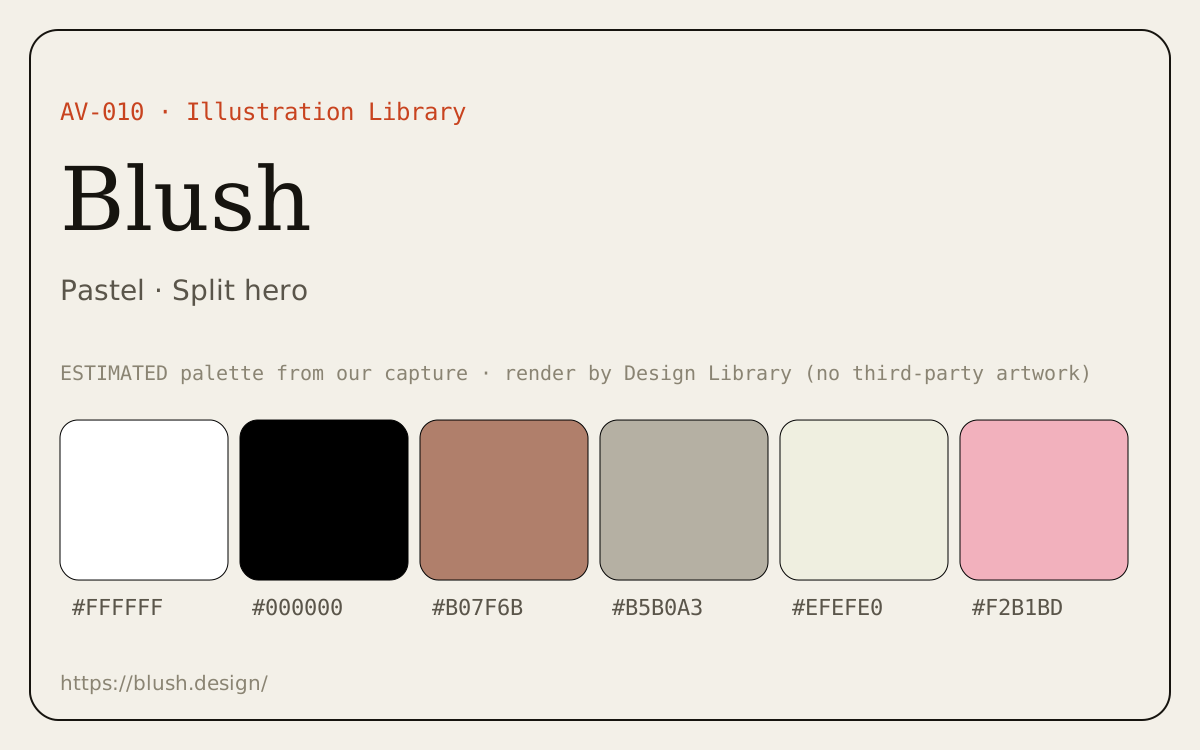
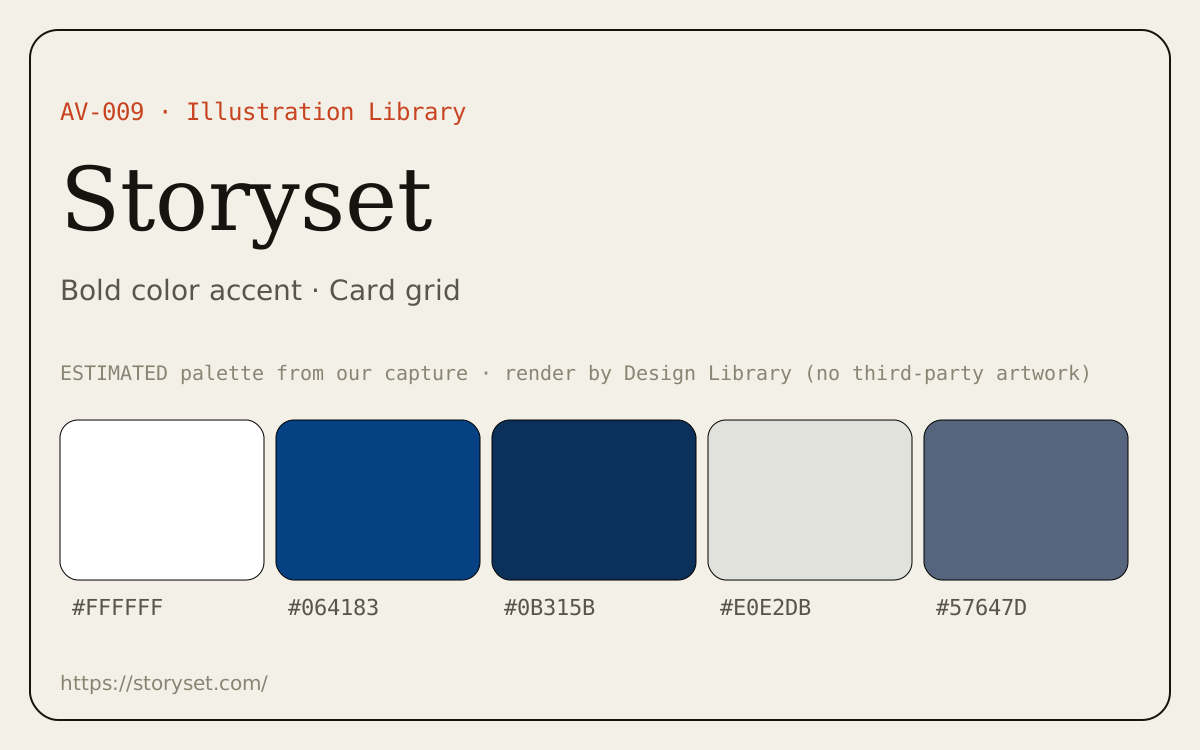
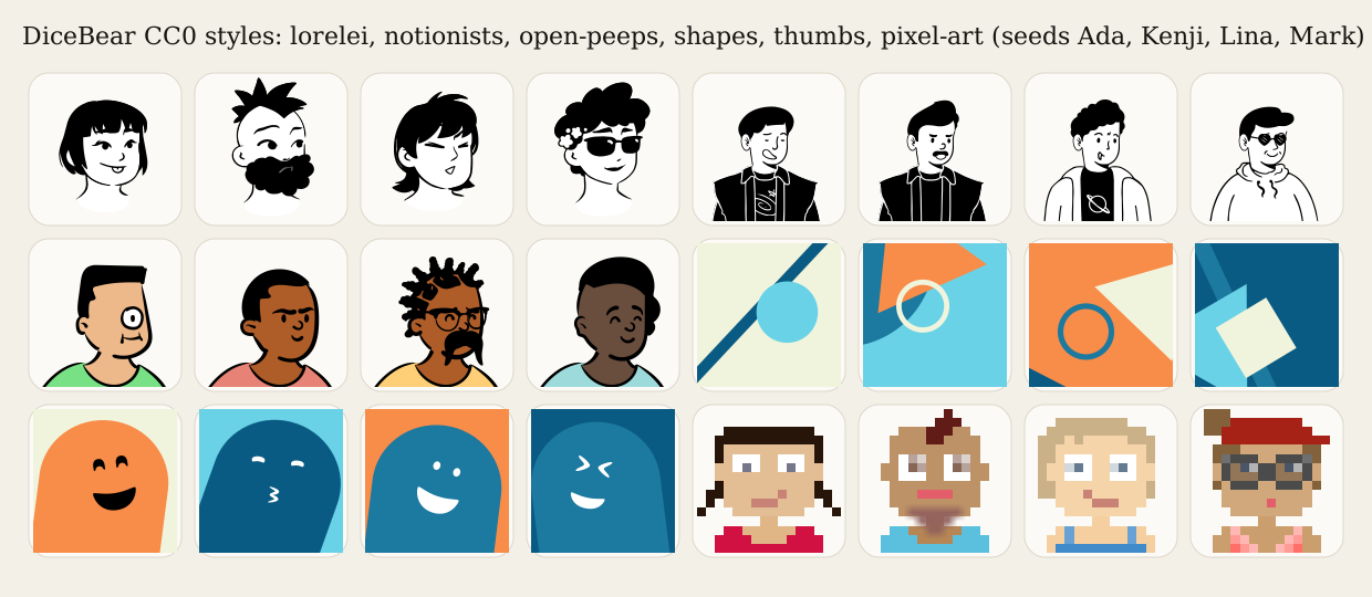
Example avatars generated by us where the license allows it; see each caption for the style and its license.
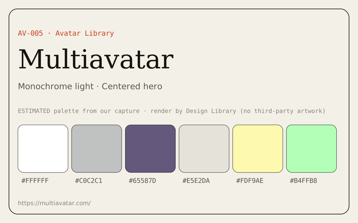
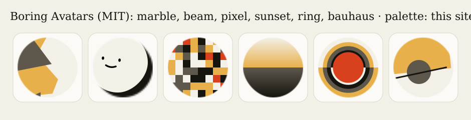
Dominant palette from our captures
Measured by us from our screenshot(s) of https://boringavatars.com/ (median-cut quantization; share = % of pixels). Approximate and not official.
Layout pattern: Card grid
Observed by us on the captured page(s). See all entries by layout.
How to apply it: Use a uniform card grid with consistent thumbnails and minimal text per card; put filters above.
Other entries with this layout: Fontshare, Logobook, Dribbble · logo tag, Behance · logo projects, Simple Icons, Airbnb, Storyset.
Our analysis
Captured boringavatars.com: a dashboard-like grid of generated avatars and palette controls on soft teal/gray surfaces.
Similar to this
Ranked by shared color theme, layout, category, type and mood tags.
Downloads
License / terms of the source: React library: MIT (boring-avatars v2.0.4 on npm). The hosted avatar service is a separate subscription product
DESIGN.md for AI coding agents
Copy this into your repo or agent context. OFFICIAL and ESTIMATED values are labelled.
# DESIGN.md · Boring Avatars (AV-004)

> Written for AI coding agents. Values marked **OFFICIAL** come from the documented source named below; values marked **ESTIMATED** were measured by us from our own screenshots and are approximate. Never treat ESTIMATED values as official brand tokens.

## Overview
- Type: Avatar Library · Category: J. Avatars and Illustrations
- Platforms: Web
- Color theme: Pastel · Layout pattern: Card grid · Mood: Playful, geometric
- License / terms: React library: MIT (boring-avatars v2.0.4 on npm). The hosted avatar service is a separate subscription product

Open-source React component that generates abstract SVG avatars (marble, beam, pixel, sunset, ring, bauhaus) from a name and a palette you provide.

### Analysis (ours)
Captured boringavatars.com: a dashboard-like grid of generated avatars and palette controls on soft teal/gray surfaces.

## Color tokens
No official color tokens documented for this entry.

ESTIMATED · dominant colors measured from our screenshot(s) of the source site (median-cut quantization; share = % of pixels). Approximate, not official:

- `#FFFFFF` ~27%
- `#C1D8D9` ~14%
- `#919C9D` ~8%

## Typography
No official type scale documented for this entry; use the product’s own typography guidance.

## Spacing, radii, shadows
Not documented for this entry. Do not invent values; derive from your own design system.

## Components
No component inventory documented for this entry.

## Layout rules
- Observed layout pattern: **Card grid** (from our captures).

## Usage
```
npm i boring-avatars
import Avatar from 'boring-avatars';
<Avatar name="Maria Mitchell" variant="beam" colors={['#16140F','#D9411E','#F3F0E8','#E8B04B','#5E584C']} />
```

## Do’s and don’ts
- Do: Use soft tonal surfaces with one stronger accent for actions.
- Don’t: Don’t rely on pastel-on-pastel for text; check contrast.
- Do: follow the source’s license/terms listed above.
- Don’t: present ESTIMATED colors as official tokens.

## Sources
- https://boringavatars.com/
- Library entry: https://design-library-byt.pages.dev/entry/AV-004